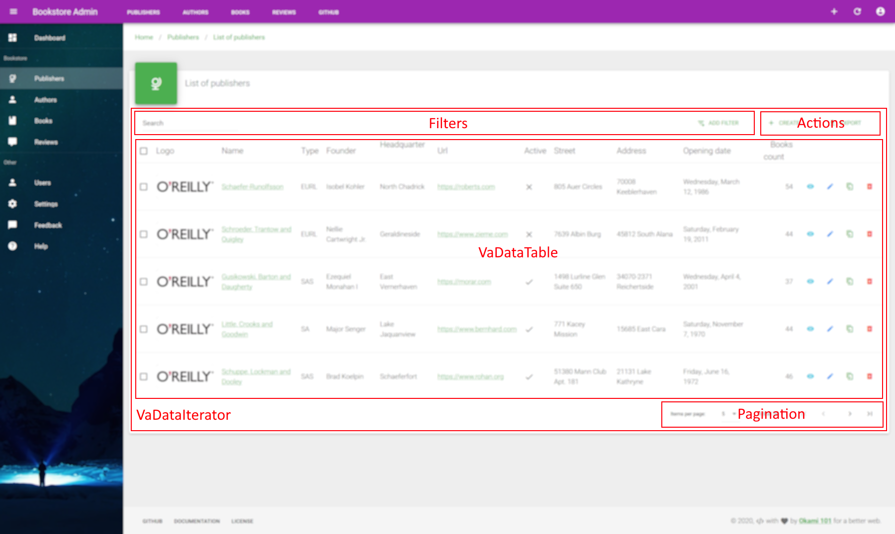
# List
The list page is the main UI entry point of your resource where you can do all sort of resources browsing operations, as paginating, sorting, filtering, exporting, etc. It's the best place to put a VaList data iterator component that will use getList data provider with all the search context. The traditional UI layout data list stay the good old full data table by using VaDataTable components, but it can be totally replaced by anything you want.
PAGE CUSTOMIZATION
Note that for every CRUD pages you are free to put anything you want, and you have not forced to use provided optimized components.
Since all data provider methods are available in a dedicated store module for each resource, it's not that complicated to create your own list components that will fetch your data. And you can of course use the current global $axios instance if you need to fetch all sort of custom data that coming out of data provider logic. See usage here.
# Data Iterator
VaList
List data iterator component, perfect for list CRUD page as well as any resource browsing standalone component.
Allow resource paginating and filtering. Use current query string context for initial state by default.
The list layout on default slot is fully customizable and can be used for separate VaDataTable component.
MIXINS
PROPS
| Props | Type | Description |
|---|---|---|
| filters | array | Exposed filters, editable through advanced filter form, update URL query string if not disabled.
Sent to your data provider inside filter params.
Use specific alwaysOn property for each filter you want to be visible and not removable.
Valid properties are source, type, label, alwaysOn, attributes. |
| itemsPerPageOptions | array | List of available selections of items per page. |
| disableQueryString | boolean | Disable real time update of URL query string on any browsing action as pagination, sorting, filtering, etc. |
| hideDefaultFooter | boolean | Hide default footer, notably default pagination. |
| disablePagination | boolean | Disable pagination, will hide default footer. |
| hideHeader | boolean | Hide all header toolbar, so neither filters nor any create or export actions. |
| disableCreate | boolean | Force disabling of create button, shown by default if create resource action available. |
| disableExport | boolean | Disable the export button. The export allows client-side CSV download and keep active filters while disabling pagination. |
| disableCreateRedirect | boolean | Disable create redirection. Will force create button to show. |
| disableGlobalSearch | boolean | Disable the global search. |
| globalSearchQuery | string | Key parameter of the global search query. |
| association | object | Association infos object in case of this list is related to a current show or edit resource page. Enable the association between resources directly by an autocomplete an associate action. |
SLOTS
| Name | Description |
|---|---|
| bulk.actions | Custom bulk actions, ideal place for VaBulkActionButton. |
| default | Custom component filters. |
| actions | Put here some global action with components based on VaActionButton. |
| footer | Best place for any custom pagination. |
EVENTS
| Name | Description |
|---|---|
| update:options | Triggered on pagination change. |
| update:filter | Triggered on filter change. |
| action | Allows you to use global action event for custom action on your side. |
| associated | Triggered on successful association of resource item. |
Here a quick sample usage within the VaDataTable component :
<template>
  <base-material-card :icon="resource.icon" :title="title">
    <va-list>
      <va-data-table :fields="fields"></va-data-table>
    </va-list>
  </base-material-card>
</template>

<script>
export default {
  props: ["resource", "title"],
  data() {
    return {
      fields: [
        { source: 'name', link: 'show' },
        { source: 'type', type: 'select' },
        'founder',
        'headquarter',
        { source: 'url', type: 'url' },
        { source: 'active', type: 'boolean' },
        { source: 'opening_date', type: 'date' },
      ],
    };
  },
};
</script>
2
3
4
5
6
7
8
9
10
11
12
13
14
15
16
17
18
19
20
21
22
23
24
25
26
It will produce this simple structure :
Note that VaList will try to be synchronized on real time within query string in order to allow any bookmark or keep state on every browser refresh. All browsing action as paginate, filter and sorting will be updated into the URL query string.
DISPLAY DATA
VaList is only responsible for data iteration UI controls. You still need to display the data list on your own or use the provided VaDataTable.
# Data Table
VaDataTable
Data table component, you will need data iterator as VaList in order to make it usable.
This component allows you to template all fields columns.
PROPS
| Props | Type | Description |
|---|---|---|
| rowClick | string|boolean | Make each row clickable. Use predefined function as edit or show. |
| fields | array | List of columns for each property of resource data.
Each column can be a simple string or a full object with advanced field properties.
Valid properties are source, type, label, sortable, align, link, attributes, editable. |
| dense | boolean | Reduce height of each row. |
| multiSort | boolean | Enable multi sort feature, enabled by default. |
| showExpand | boolean | Enable row expand mode. Use it for quick detail view. |
| singleExpand | boolean | Only one row can expanded at once |
| disableSelect | boolean | Disable select feature. |
| disableSort | boolean | Disable sorting. |
| disableShow | boolean | Disable show action row. |
| disableEdit | boolean | Disable show action row. |
| disableClone | boolean | Disable clone action row. |
| disableDelete | boolean | Disable delete action row. |
| disableActions | boolean | Disable actions column. |
| disableCreateRedirect | boolean | Disable create redirection. Will force clone button to show. |
| disableShowRedirect | boolean | Disable show redirection. Will force show button to show. |
| disableEditRedirect | boolean | Disable edit redirection. Will force edit button to show. |
| association | object | Association infos object in case of this list is related to a current show or edit resource page. Enable the dissociation between resources directly by an additional dissociation action. |
| rowCreate | boolean | Allow new item row. |
| rowEdit | boolean | Allow editable row. |
| createData | object | Additional form object data to merge with row-create form. |
| updateData | object | Additional form object data to merge with row-edit form. |
SLOTS
| Name | Description |
|---|---|
| default | Use for field cell templating. |
| cell.actions | Full cell template which contains all row actions. |
| item.actions | Use it for additional custom row actions with components based on VaActionButton. |
| expanded-item | Place for full width cell which contains additional item infos. Visible when row is expanded. |
EVENTS
| Name | Description |
|---|---|
| dissociated | Triggered on successful dissociation of resource item. |
| deleted | Triggered on successful deletetion of ressource item. |
| row-click | Generic row-click event if you set rowClick on true with selected item. |
| item-action | Triggered on action on specific row. This event will return a freshed item Object from your API. |
CONTEXT SYNCHRONIZATION
As the VaDataTable is a dumb component, it needs to be synchronized with a context data. As seen at the above code example, the simplest way is to use VaList as data browsing control that will automatically inject following behaviors :
- Current resource and items : Pass all result data from iterator into data table with total.
- Loading state : for activating busy mode when fetching on API.
- Selected items : Keep selected items used for bulk operation synchronized, all selected items in data table will be reflected on data iterator and vice-versa.
- Current search context: Keep current search query context synchronized between all components, as the data table will add sorting support.
# Fields
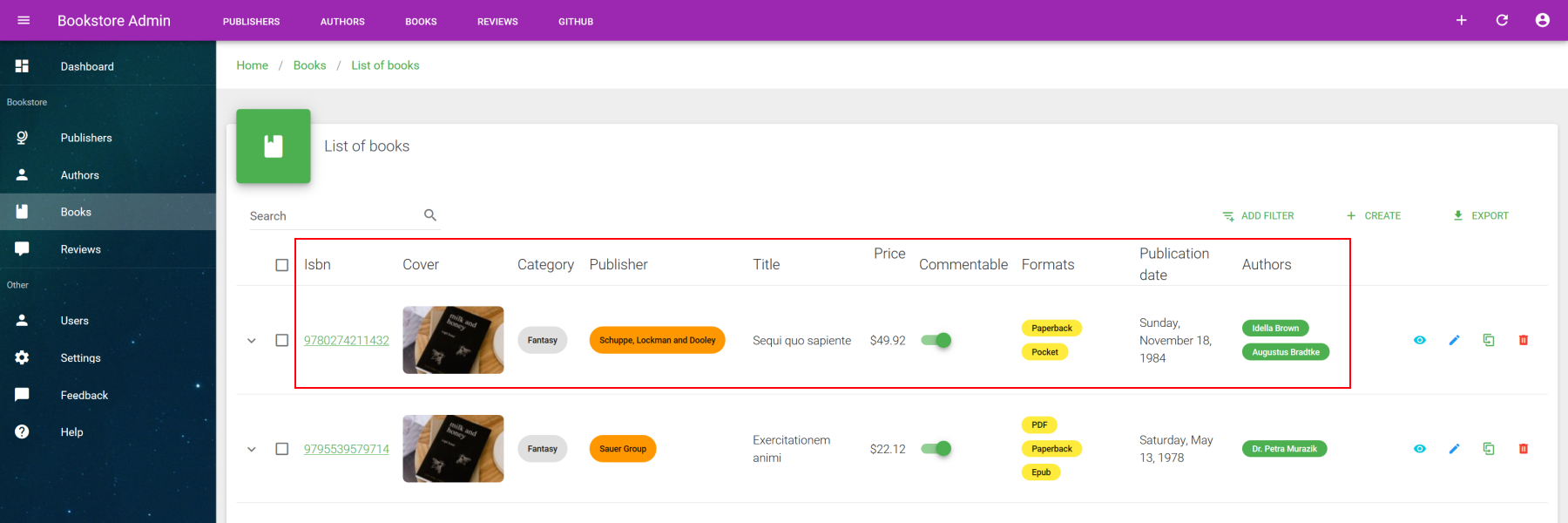
Use fields prop in order to define all columns. It's an array of string or object where can precise the best suited field formatter for data display. You need at least to set source property which defined the field of resources you want to fetch, then the type for data formatter if different than simple text format. For all supported fields, check the fields section.
<template>
  <base-material-card :icon="resource.icon" :title="title">
    <va-list>
      <va-data-table :fields="fields"></va-data-table>
    </va-list>
  </base-material-card>
</template>

<script>
export default {
  props: ["resource", "title"],
  data() {
    return {
      fields: [
        { source: "isbn", link: "show" },
        {
          source: "cover",
          type: "image",
          link: "show",
          attributes: {
            src: "thumbnails.small",
          },
        },
        { source: "category", type: "select", attributes: { chip: true } },
        {
          source: "publisher",
          type: "reference",
          attributes: {
            reference: "publishers",
            text: "name",
            chip: true,
            color: "orange",
          },
        },
        { source: "title", sortable: true },
        {
          source: "price",
          type: "number",
          sortable: true,
          attributes: {
            format: "currency",
          },
        },
        { source: "commentable", type: "boolean", editable: true },
        {
          source: "formats",
          type: "array",
          attributes: {
            select: true,
            color: "yellow",
            small: true,
            column: true,
          },
        },
        {
          source: "publication_date",
          type: "date",
          sortable: true,
        },
        "authors",
      ],
    };
  },
};
</script>
2
3
4
5
6
7
8
9
10
11
12
13
14
15
16
17
18
19
20
21
22
23
24
25
26
27
28
29
30
31
32
33
34
35
36
37
38
39
40
41
42
43
44
45
46
47
48
49
50
51
52
53
54
55
56
57
58
59
60
61
62
63
64
65
See all supported field properties :
| Property | Type | Description |
|---|---|---|
| source | string | Resource property to display. |
| type | string | Type of field to use. |
| label | string | Column title header, use localized property source by default. |
| labelKey | string | Override default source as i18n key message |
| sortable | boolean | Activate server-side sort. |
| align | string | You can Use left, right, center for each cell align attribute. |
| link | string | Use any valid show or edit action if you want to wrap field inside resource action link. |
| input | string | Type of input to use for editable form rows. Override above type props which is used by default. |
| attributes | object | All props or attributes to merge to the under field or input component. |
| editable | boolean | Replace field by a live edit input. Ideal for quick live toggle switch updates. |
SHORTHAND
You can use a simple string for each field column, "my-property" is similar to { source: "my-property" }.
# Field templating
In case of all above field options doesn't suit your needs, you can perfectly use advanced slot templating for each field. You can even use all VA fields inside it. Very useful when you need to nest this field component within parent component as shown next :
<template>
  <base-material-card :icon="resource.icon" :title="title">
    <va-list>
      <va-data-table :fields="fields">
        <template v-slot:[`field.authors`]="{ value }">
          <v-chip-group column>
            <va-reference-field
              reference="authors"
              v-for="(item, i) in value"
              :key="i"
              color="primary"
              small
              chip
              :item="item"
            >
            </va-reference-field>
          </v-chip-group>
        </template>
      </va-data-table>
    </va-list>
  </base-material-card>
</template>

<script>
export default {
  props: ["resource", "title"],
  data() {
    return {
      fields: [
        //...
        "authors",
        //...
      ],
      //...
    };
  },
  //...
};
</script>
2
3
4
5
6
7
8
9
10
11
12
13
14
15
16
17
18
19
20
21
22
23
24
25
26
27
28
29
30
31
32
33
34
35
36
37
38
39
You just have to use a slot named as field.{source} for that, where source is the name of field. This slot will provide to you full row resource item and value of the cell that will be rendered as default.
# Expandable row
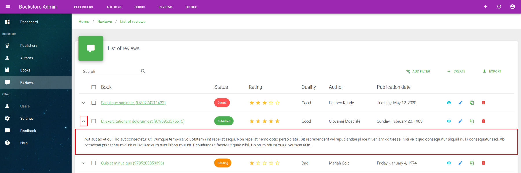
You can use the expanded-item slot with enabled show-expand prop for an additional full colspan cell under the item row. Ideal for quick view.
<template>
  <base-material-card :icon="resource.icon" :title="title">
    <va-list>
      <va-data-table :fields="fields" show-expand>
        <template v-slot:expanded-item="{ item }">
          {{ item.description }}
        </template>
      </va-data-table>
    </va-list>
  </base-material-card>
</template>
2
3
4
5
6
7
8
9
10
11
# Custom row actions
If you need other item actions in addition to classic crud operations, use the dedicated item.actions slot.
<template>
  <base-material-card :icon="resource.icon" :title="title">
    <va-list>
      <va-data-table :fields="fields">
        <template v-slot:[`item.actions`]="{ resource, item }">
          <impersonate-button
            :resource="resource"
            :item="item"
            icon
          ></impersonate-button>
        </template>
      </va-data-table>
    </va-list>
  </base-material-card>
</template>
2
3
4
5
6
7
8
9
10
11
12
13
14
15
# Search
A global search filter will be enabled by default. To disable it, use disableGlobalSearch prop.
This filter will send the string search query on backend via the key configured on globalSearchQuery, which is q by default.
Then you have to deal on backend side for SQL processing, for example via a multi columns LIKE search. If you use the separate Laravel package (opens new window) for your Laravel app, you can use the dedicated SearchFilter for that.
INTERNAL FILTERS
In addition to exposed filters, you may need some internal filters that user cannot modify through UI. Use filter prop for that. It's an simple key-value object that will be automatically sent to your data provider, merged with any other active filters.
# Advanced filters
In addition to global search, VaList supports advanced custom filters as well with many supported inputs as shown here :
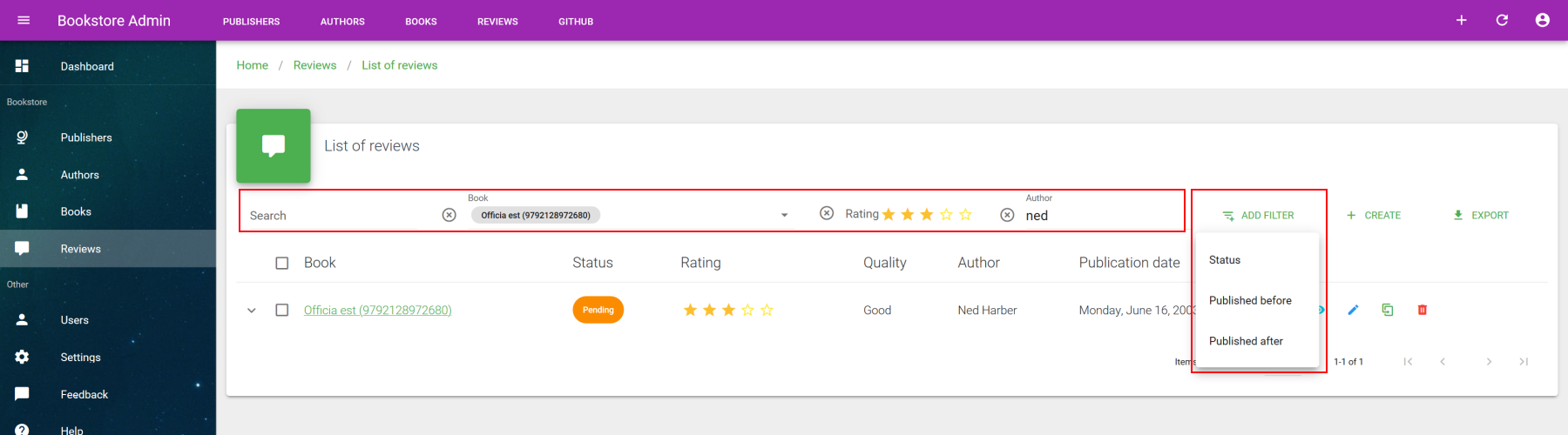
Use the "Add filter" button for adding more filters that will add a new AND condition. The supported inputs for filtering are text, number, boolean, date, rating, select, autocomplete. Each filter are removable.
In order to define new filters, use the filters props. Here are a code sample usage of this advanced filters :
<template>
  <base-material-card :icon="resource.icon" :title="title">
    <va-list :filters="filters">
      <!-- VaDataTable -->
    </va-list>
  </base-material-card>
</template>

<script>
export default {
  props: ["resource", "title"],
  data() {
    return {
      filters: [
        {
          source: 'book',
          type: 'autocomplete',
          optionText: 'title',
          multiple: true,
          reference: 'books',
        },
        { source: 'rating', type: 'rating' },
        {
          source: 'status',
          type: 'select',
          multiple: true,
        },
        'author',
        {
          source: 'published_before',
          type: 'date',
        },
        {
          source: 'published_after',
          type: 'date',
        },
      ],
    };
  },
};
</script>
2
3
4
5
6
7
8
9
10
11
12
13
14
15
16
17
18
19
20
21
22
23
24
25
26
27
28
29
30
31
32
33
34
35
36
37
38
39
40
41
You will mainly use mandatory source property as well as type for input type. Each added filter will be added to the "Add filter" dropdown button for on-asking filter activation, unless alwaysOn property is set to true. In that case, filter will be always visible and not removable.
Use attributes property in order to merge specific attributes into input component. See dedicated inputs section for further detail on valid props for each filterable inputs.
See all supported field properties :
| Property | Type | Description |
|---|---|---|
| source | string | Resource property to display. |
| type | string | Type of input to use. |
| label | string | Column title header, use localized property source by default. |
| labelKey | string | Override default source as i18n key message |
| alwaysOn | boolean | Keep filter always active and visible. Not removable. |
| attributes | object | All props or attributes to merge to the input component. |
# Filter templating
As same way as field templating you can even template your filter directly by using filter.{source} slot, where source is the name of filter. However, as your custom filter component must return input on change in order to work with current active filter, you will need to expose the internal filter of VaList by filter.sync, and then update the filter with new value on each input change.
Here is a full working sample :
<template>
  <base-material-card :icon="resource.icon" :title="title">
    <va-list :filters="filters" :filter.sync="filter">
      <template v-slot:filter.headquarter="props">
        <va-text-input
          hide-details
          :filled="false"
          v-bind="props"
          @input="(val) => update('headquarter', val)"
        ></va-text-input>
      </template>
      <va-data-table :fields="fields"></va-data-table>
    </va-list>
  </base-material-card>
</template>

<script>
export default {
  props: ["resource", "title"],
  data() {
    return {
      filter: {},
      filters: [
        "name",
        "founder",
        "headquarter",
        { source: "active", type: "boolean" },
      ],
      fields: [
        //...
      ],
    };
  },
  methods: {
    update(source, value) {
      this.filter = {
        ...this.filter,
        [source]: value,
      };
    },
  },
};
</script>
2
3
4
5
6
7
8
9
10
11
12
13
14
15
16
17
18
19
20
21
22
23
24
25
26
27
28
29
30
31
32
33
34
35
36
37
38
39
40
41
42
43
# Global actions
This VaList component comes with 2 provided global actions, which are create and export. The create button will only appear if current resource has create action and if authenticated user has create permission on this resource.
ACTION EVENTS
You're not forced keep the default redirect behavior button. If you prefer a create event, just subscribe to action event and disable create redirect via disableCreateRedirect prop for preventing create button to redirect to linked action page.
You will have the same behavior for show, edit and clone actions inside VaDataTable. Use item-action event and disable default redirect if you need custom behavior on your side as aside or dialog edition.
Note that all of this buttons will auto hide if no action exist for each related button. Deactivation of each relevant action redirect will force buttons to reappear.
This action events will always provide you the freshed item from the API as well as the adapted CRUD title. See the users list of Vue CLI Plugin for full example with aside.
# Export
The export button will process a CSV file download on client side. It simply takes the current search context and refetch data on server side, while keeping current filters and sorts without any pagination infos.
SERVER-SIDE EXPORT
Because the client-side exports has it's own limits and limited to basic CSV, you can always create a custom action that do an export on server-side. Create a custom href button as shown below and use disableExport prop. Your href should contain all search context provided by options without any pagination infos and redirect to a valid API endpoint that return a response with attachment content in order to provoke a file download.
# Custom actions
You can add custom actions via actions slot :
<template>
  <base-material-card>
    <va-list>
      <template v-slot:actions>
        <my-custom-button></my-custom-button>
      </template>
      <!-- VaDataTable -->
    </va-list>
  </base-material-card>
</template>
2
3
4
5
6
7
8
9
10
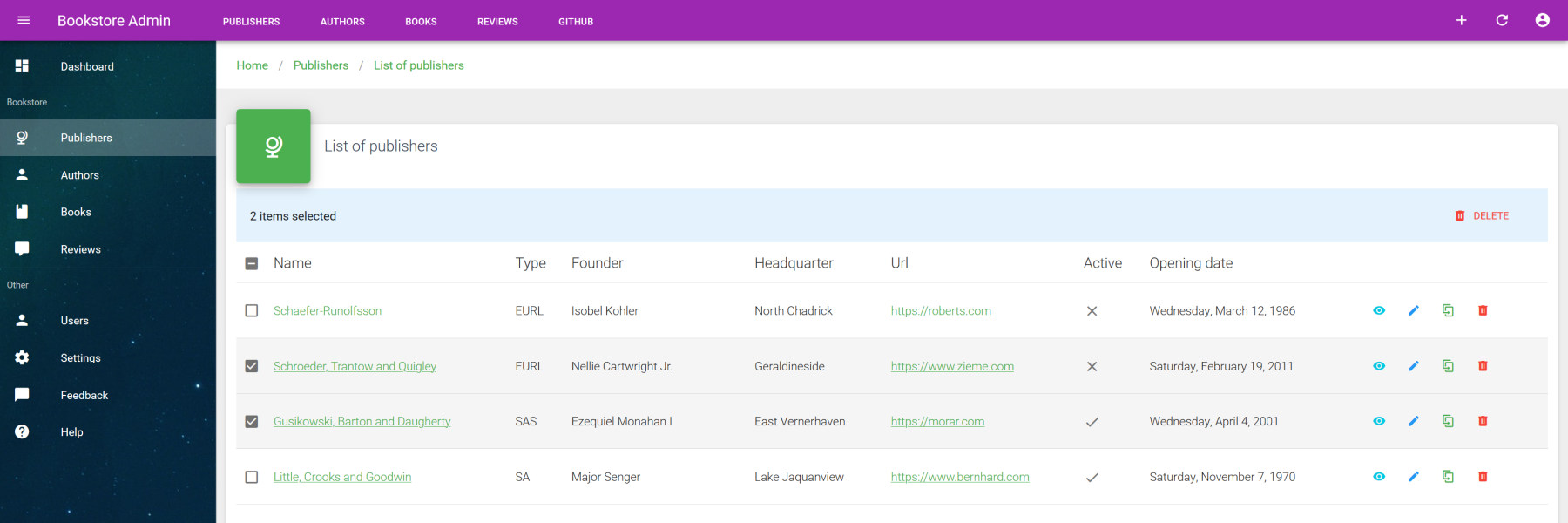
# Bulk actions
The data iterator support all sort of bulk operations, whether it be updating or deleting. This feature will use updateMany and deleteMany methods of you data provider. All available bulk actions will appear at header as soon as you have selected some items.
# Custom bulk actions
By default VA provides a bulk delete action, but you can add any multiple bulk actions as needed by using bulk.actions slots and VaBulkActionButton that will use updateMany under the hood. This last component needs a required action prop that will be the object to send to your API. This object will contain all properties you want to bulk update.
The next example will show you a bulk publish / unpublish bulk actions :
<template>
  <base-material-card>
    <va-list>
      <template v-slot:actions>
        <va-bulk-action-button
          :label="$t('users.enable')"
          icon="mdi-publish"
          color="success"
          :action="{ active: true }"
          text
        ></va-bulk-action-button>
        <va-bulk-action-button
          :label="$t('users.disable')"
          icon="mdi-download"
          color="orange"
          :action="{ active: false }"
          text
        ></va-bulk-action-button>
      </template>
      <va-data-table :fields="fields"></va-data-table>
    </va-list>
  </base-material-card>
</template>
2
3
4
5
6
7
8
9
10
11
12
13
14
15
16
17
18
19
20
21
22
23
SELECTED ITEMS
VaBulkActionButton will automatically use injected search state to get all items to interact.
# Pagination
By default, VaList will use the default vuetify pagination control which allows direct page control navigation as well as number of shown item per page. Use itemsPerPage and itemsPerPageOptions in order to initialized the maximum number of shown item per page.
This default control is totally replaceable by your own pagination control. Use footer slot property for that and set hideDefaultFooter prop to true. This slot will provide all pagination context infos as well as server-side total of items.
# Usage outside list page
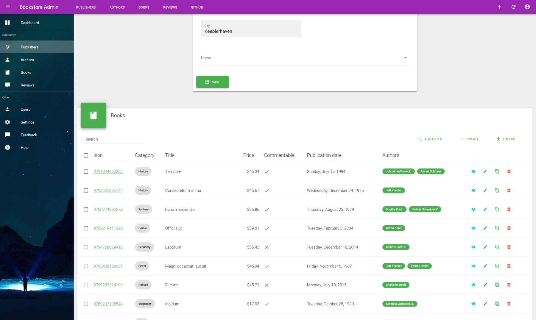
You're not forced to use VaList on list page ! As the same way for most of VA components, it can be used anywhere on any page or context thanks to resource prop which is present on all resource aware VA components. When not defined, the default resource will be the one linked to the current route.
Next example shows a good use case of VaList inside a VaEditLayout page in order to show some related resources linked to the current edited item resource.
<template>
  <va-edit-layout>
    <publishers-form :id="id" :title="title" :item="item"></publishers-form>
    <base-material-card icon="mdi-book" title="Books">
      <va-list
        resource="books"
        disable-query-string
        :filter="{
          publisher: id,
        }"
      >
        <va-data-table :fields="fields">
          <!-- VaDataTable -->
        </va-data-table>
      </va-list>
    </base-material-card>
  </va-edit-layout>
</template>
2
3
4
5
6
7
8
9
10
11
12
13
14
15
16
17
18
Note that the only thing to do is to provide explicitly the resource to fetch and use the filter which allows us to add internal filters, perfect place for adding the current resource as filter.
QUERY STRING
For this case usage, you may disable default query string update in order to prevent unexpected behavior. Use disable-query-string for that.
# Associations
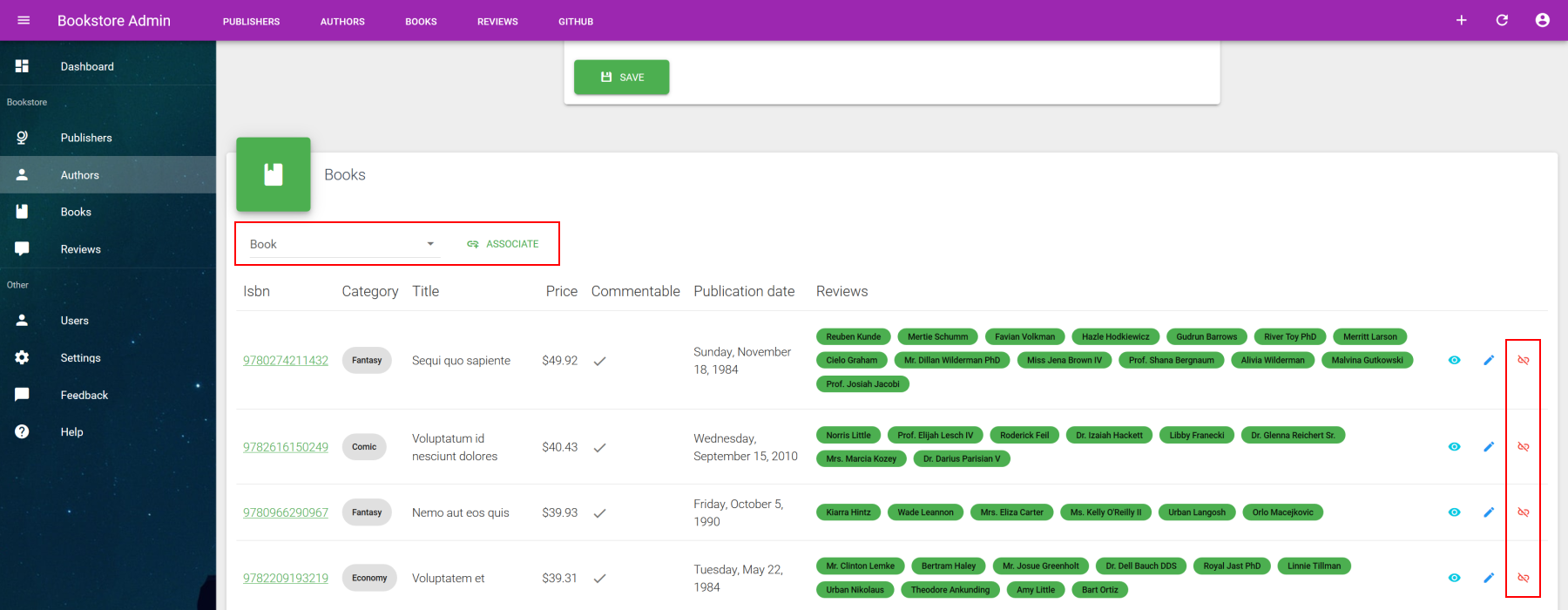
You can go even further by managing associations thanks to provided association prop object that give us the ability of attach or detach relationship between related resources directly from the list. It will automatically generate a autocomplete search on given list resource that allow us to attach via the associate button. Each row item can be detach via dissociate button.
See this example :
<template>
  <va-edit-layout>
    <authors-form :id="id" :title="title" :item="item"></authors-form>
    <base-material-card
      icon="mdi-book"
      :title="$tc('resources.books.name', 10)"
    >
      <va-list
        resource="books"
        disable-global-search
        disable-pagination
        disable-query-string
        disable-create
        disable-export
        :association="association"
        :filter="{
          authors: id,
        }"
        :include="['publisher', 'reviews']"
      >
        <va-data-table
          resource="books"
          disable-sort
          disable-select
          disable-clone
          disable-delete
          :association="association"
          :fields="fields"
        ></va-data-table>
      </va-list>
    </base-material-card>
  </va-edit-layout>
</template>

<script>
export default {
  props: ["id", "title", "item"],
  data() {
    return {
      fields: [
        //...
      ],
      association: {
        resource: "authors",
        source: "author_id",
        id: this.id,
      },
    };
  },
};
</script>
2
3
4
5
6
7
8
9
10
11
12
13
14
15
16
17
18
19
20
21
22
23
24
25
26
27
28
29
30
31
32
33
34
35
36
37
38
39
40
41
42
43
44
45
46
47
48
49
50
51
Expected properties of association :
| Property | Type | Description |
|---|---|---|
| resource | string | Resource that you want to link / unlink. Just for localization purpose. |
| source | string | Name of request key data to send on backend. |
| id | number | ID of current resource to detach. |
For both associate and dissociate actions, the update data provider method will be called on the listed resource (which is books for this example) with this data : { <type>_<source>: <id> }. type will correspond to the type of operation, which is add or remove. It's up to you to make the effective association from server-side.
LARAVEL EXAMPLE
Here is a code sample you can use on your update endpoint of your controller for a pivot relation :
if ($id = $request->input('add_author_id')) {
    $book->authors()->attach($id);
}

if ($id = $request->input('remove_author_id')) {
    $book->authors()->detach($id);
}
2
3
4
5
6
7
# Editable rows
For simple resources, you can enable the direct row form mode :
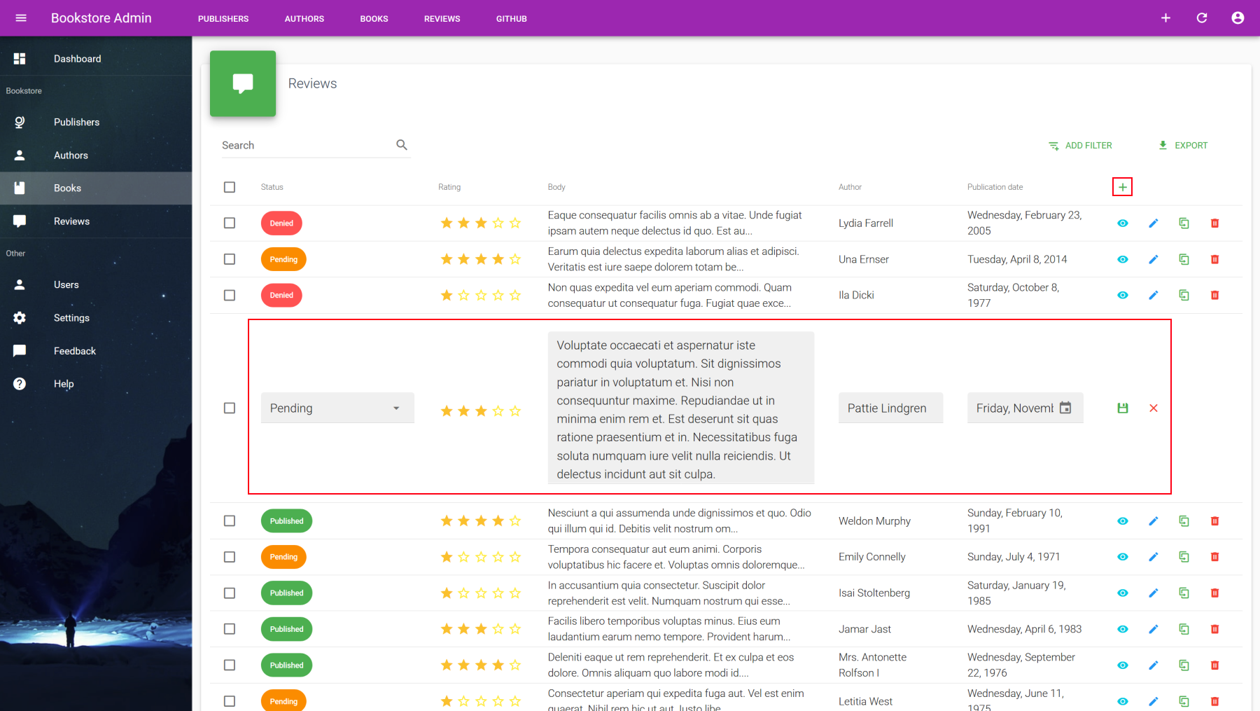
Use both row-create and row-edit props to enable it :
row-createwill add a new plus button inside header actions column. You may usedisable-createinside direct parentVaListin order to disable normal creation behavior or simply disablecreateaction for the concerned resource. On click it will show a empty new form at first row.row-editwill change the default edit button behavior. On click it will transform the entire row into form row with pre filled values.
<template>
  <va-edit-layout>
    <books-form :id="id" :title="title" :item="item"></books-form>
    <base-material-card
      icon="mdi-comment"
      :title="$admin.getResource('reviews').pluralName"
    >
      <va-list
        resource="reviews"
        disable-query-string
        :items-per-page="10"
        :filter="{
          book: id,
        }"
        :filters="filters"
        disable-create
      >
        <va-data-table
          :fields="fields"
          row-create
          row-edit
          :create-data="{
            book_id: id,
          }"
        ></va-data-table>
      </va-list>
    </base-material-card>
  </va-edit-layout>
</template>
2
3
4
5
6
7
8
9
10
11
12
13
14
15
16
17
18
19
20
21
22
23
24
25
26
27
28
29
FORM DATA
You may use create-data and update-data props for merging some external data into respective create and edit forms. Ideal for passing required properties for creation as the mandatory related book for any reviews.
# Custom layout
As you have seen, VaList is mainly a data iterator that will provide items result into his default slot children components, which is VaDataTable here. As the browsing UI structure is totally separated from the data list display, you can use any custom list layout as you want.
It will allow you to have this kind of nice card list layout while conserving all UI resource browsing controls with full pagination and filters.
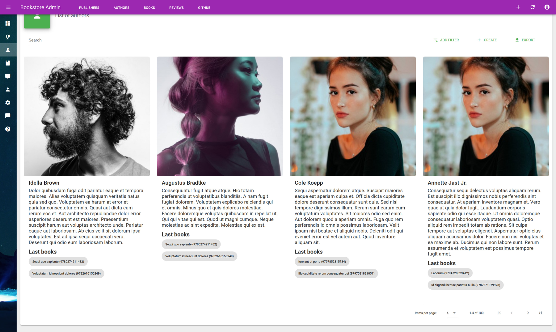
The only thing to do is to use the default slot of VaList which allows you to implement your custom template item list from the provided items binding value as shown here :
<template>
  <base-material-card>
    <va-list
      :items-per-page="8"
      :items-per-page-options="[4, 8, 16, 32]"
    >
      <template v-slot="{ items }">
        <v-row>
          <v-col lg="3" v-for="item in items" :key="item.id">
            <v-card
              class="my-3 fill-height"
              flat
              :to="{ name: 'authors_show', params: { id: item.id } }"
            >
              <v-card-title>
                {{ item.name }}
              </v-card-title>
            </v-card>
          </v-col>
        </v-row>
      </template>
    </va-list>
  </base-material-card>
</template>
2
3
4
5
6
7
8
9
10
11
12
13
14
15
16
17
18
19
20
21
22
23
24
# Aside usage sample
Instead of have separate CRUD pages for each action, it's possible to regroup all CRUD view operations into single page list thanks to VaAsideLayout component. It's perfect if you show and form views are relatively small.
# AsideLayout
VaAsideLayout
Component to use for showing information on aside from any components. Use Portal Vue plugin internally for integrate within VaAside.
PROPS
| Props | Type | Description |
|---|---|---|
| title | string | Title of aside. |
SLOTS
| Name | Description |
|---|---|
| default | Main content of the aside. |
USELESS ROUTES
If you use aside for crud operations, you may disable related show, create and edit routes. As shown in resources guide section, use actions or except resource properties for that :
src/resources/index.js
export default [
  //...
  {
    name: "users",
    icon: "mdi-account",
    label: "name",
    actions: ["list", "delete"],
    permissions: ["admin"],
  },
];
2
3
4
5
6
7
8
9
10
The default users template generated by Vue CLI Plugin is a good showcase for that :
<template>
  <div>
    <va-aside-layout :title="asideTitle">
      <users-show v-if="show" :item="item"></users-show>
      <users-form v-else :id="id" :item="item" @saved="onSaved"></users-form>
    </va-aside-layout>
    <base-material-card :icon="resource.icon" :title="title">
      <va-list
        ref="list"
        disable-create-redirect
        @action="onAction"
      >
        <va-data-table
          :fields="fields"
          disable-create-redirect
          disable-show-redirect
          disable-edit-redirect
          @item-action="onAction"
        ></va-data-table>
      </va-list>
    </base-material-card>
  </div>
</template>

<script>
export default {
  props: ["resource", "title"],
  data() {
    return {
      fields: [
        //...
      ],
      asideTitle: null,
      id: null,
      item: null,
      show: false,
    };
  },
  methods: {
    async onAction({ action, title, id, item }) {
      this.asideTitle = title;
      this.id = id;
      this.show = action === "show";
      this.item = item;
    },
    onSaved() {
      this.asideTitle = null;
      this.$refs.list.fetchData();
    },
  },
};
</script>
2
3
4
5
6
7
8
9
10
11
12
13
14
15
16
17
18
19
20
21
22
23
24
25
26
27
28
29
30
31
32
33
34
35
36
37
38
39
40
41
42
43
44
45
46
47
48
49
50
51
52
It's mainly a combination of all available event actions via action and item-action which retrieve the freshed item from the API and CRUD title. Then all that's left is to disable default redirect and made some additional logic for show or hide the view or form while auto open aside via value prop of VaAsideLayout. Check the users CRUD sample for further detail.
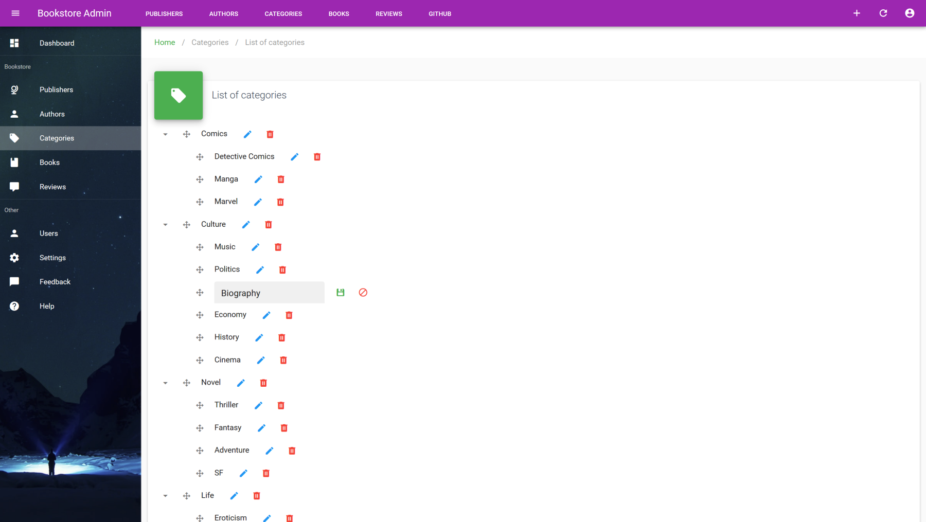
# Treeview
This component will be ideal for all hierarchical data management as categories, menus or any generic taxonomies. It supports inline node edition and deletion with additional create form at the bottom, while keeping each node fully customizable via slots. Moreover it uses the customized Vuetify original Treeview under the hood which adds draggable support !
# API
VaTreeview
Treeview component which support fully editable items with draggable feature and hierarchical data.
MIXINS
PROPS
| Props | Type | Description |
|---|---|---|
| value | array | All selected items via checkbox, can be use via v-model. |
| itemKey | string | Unique identifier for each node, id by default. |
| itemText | string | Label text for each node, name by default. |
| selectable | boolean | Enable checkbox selection. |
| openAll | boolean | Open all nodes by default. Can't be used with lazy. |
| dense | boolean | Reduce height of each node. |
| lazy | boolean | Enable lazy items loading while node opening.
Use getNodes data provider method instead of getTree. |
| editable | boolean | Enable full editable mode with drag & drop. |
| disableCreate | boolean | Disable new item creation form. |
| disableEdit | boolean | Disable item edit button. |
| disableDelete | boolean | Disable item deletion button. |
| disableInlineEdit | boolean | Disable default inline edit form behavior.
You may use item-edit event in order to add your custom edit logic. |
| filter | object | Internal active filter.
Sent to your data provider inside filter params. |
| createData | object | Additional form object data to merge when new item created. |
| updateData | object | Additional form object data to merge when specific item updated. |
SLOTS
| Name | Description |
|---|---|
| item | Use for full node templating. |
EVENTS
| Name | Description |
|---|---|
| input | Triggered when nodes are selected via checkboxes. |
| item-moved | Triggered when node moved. |
| item-edit | Triggered when node enter edit mode. |
| item-created | Triggered when new node created. |
| item-updated | Triggered when node updated. |
| item-deleted | Triggered when node deleted. |
# Tree data provider methods
Know that you will need to implement following specific data providers methods in order to allow hierarchical data manipulation.
const dataProvider = {
  getTree:    (resource, params) => Promise,
  getNodes:   (resource, params) => Promise,
  moveNode:   (resource, params) => Promise,
}
2
3
4
5
# Tree methods call signatures
| Method | Description | Parameters format |
|---|---|---|
| getTree | Get full hierarchical data as tree format. | { filter: Object } |
| getNodes | Get sibling nodes of optional given parent. load only root nodes if parent empty. | { filter: Object, parent: Object } |
| moveNode | Allow node moving to specific position of specific optional parent. | { id: Any, source: Object, destination: Object, position: int } |
// Fetching categories as tree
let { data } = await provider.getTree("categories", { filter: { type: 'book' } });
console.log(data)

// Fetching root categories
let { data } = await provider.getNodes("categories", { filter: { type: 'book' } });
console.log(data)

// Fetching children of given parent category
let { data } = await provider.getNodes("categories", { parent: { id: 1, name: "BD" } });
console.log(data)

// Move category to specific position at specific other category
await provider.moveNode("categories", { source: { id: 10, name: "Marvel" }, destination: { id: 1, name: "BD" }, position: 3 });
2
3
4
5
6
7
8
9
10
11
12
13
14
# Tree API call formats
| Operation | API call format | Response format |
|---|---|---|
| getTree | GET /categories/tree | { data: Resource[] } |
| getNodes | GET /categories/nodes/{parentId?} | { data: Resource[] } |
| moveNode | PATCH /categories/{categoryId}/move | { data: Resource } |
Note as the getTree method will wait for a valid tree formatted list. Each node item must have a specific children property which contain all sub-nodes as following :
[
  {
    id: 1,
    name: "Comics",
    children: [
      { id: 3, name: "Detective Comics" },
      { id: 4, name: "Manga" },
      { id: 2, name: "Marvel" },
    ],
  },
  {
    id: 10,
    name: "Culture",
    children: [
      { id: 11, name: "History" },
      { id: 12, name: "Biography" },
      { id: 13, name: "Cinema" },
      { id: 14, name: "Music" },
      { id: 15, name: "Politics" },
      { id: 16, name: "Economy" },
    ],
  },
  ...
];
2
3
4
5
6
7
8
9
10
11
12
13
14
15
16
17
18
19
20
21
22
23
24
KEY AND DISPLAYED TEXT
By default treeview will use id as key and name as displayed label. But it can be changed thanks to itemKey and itemText props.
# Component usage
Once all above data provider methods implemented, you can finally use treeview component as following :
<template>
  <base-material-card :icon="resource.icon" :title="title">
    <va-treeview
      open-all
      dense
      editable
      :filter="{ type: 'book' }"
      :create-data="{ type: 'book' }"
    ></va-treeview>
  </base-material-card>
</template>

<script>
export default {
  props: ["resource", "title"],
};
</script>
2
3
4
5
6
7
8
9
10
11
12
13
14
15
16
17
As other resource based components, treeview will use linked resource of current route as default (use resource prop for override). It will automatically fetch all nodes (or only root nodes if lazy prop active) as tree format.