# Show
The show page is used to be display full detail of particular resource item via usage of getOne data provider method. Vuetify Admin facilitates his development by providing a standard layout as well as many field components as value resource property formatters. As always, it's stay a standard view page component, so no real limit for delivering any advanced show view you can imagine.
# Show layout
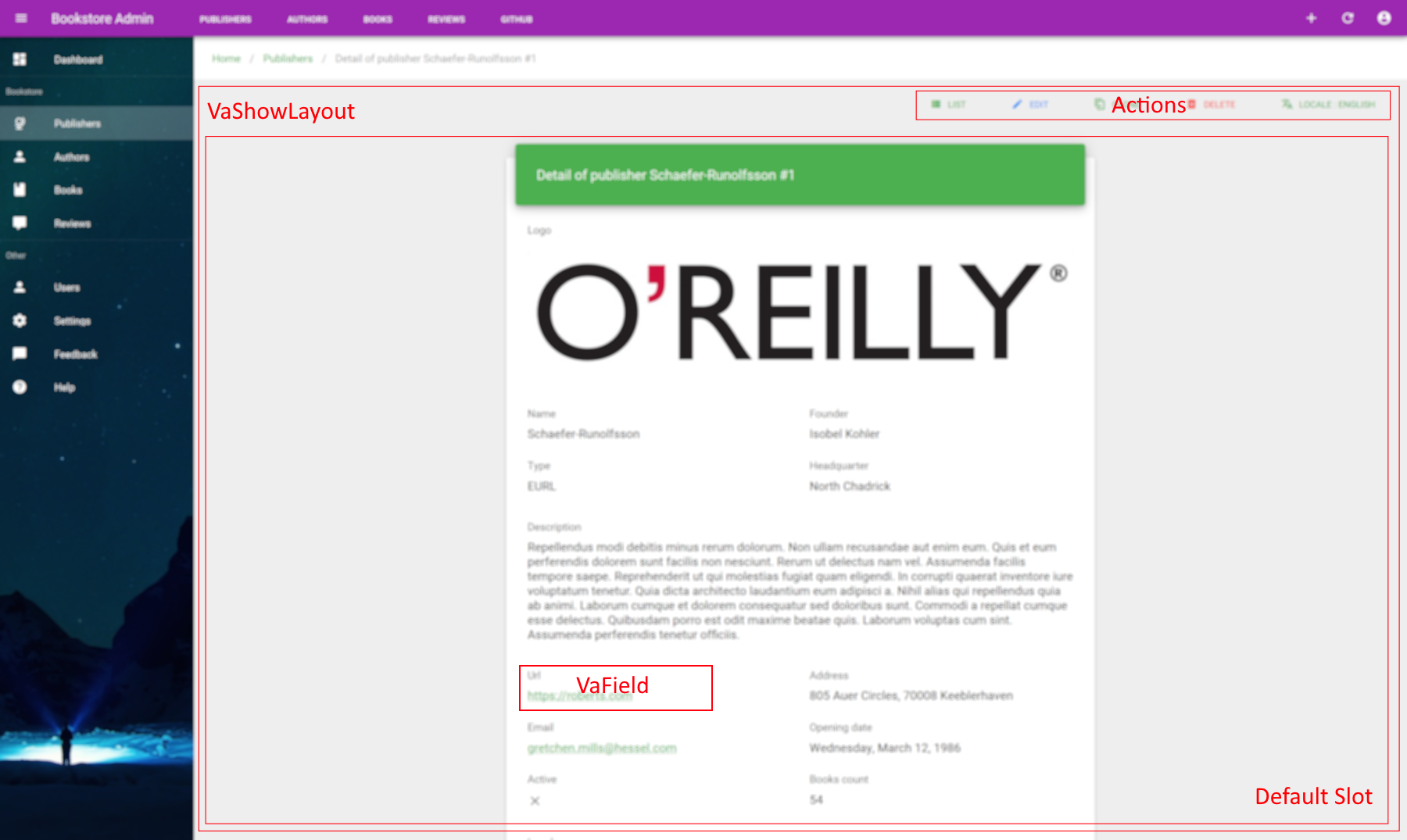
VaShowLayout
Page layout for resource detail showing. It's the better place for made heavy usage of any VA fields. Contain specific related action as deleting, cloning, editing as well as translation action.
MIXINS
PROPS
| Props | Type | Description |
|---|---|---|
| title | string | Optional H1 title of the page shown on the left of top header |
SLOTS
| Name | Description |
|---|---|
| actions | Additional custom action buttons placeholder. |
| default | Page content placeholder. |
# Custom actions
You can add specific global item actions on top header of VaShowLayout by using actions slot :
<template>
  <va-show-layout>
    <template slot="actions">
      <impersonate-button :item="item"></impersonate-button>
    </template>
    <!-- Default slot -->
  </va-show-layout>
</template>
2
3
4
5
6
7
8
# Tabbed layout
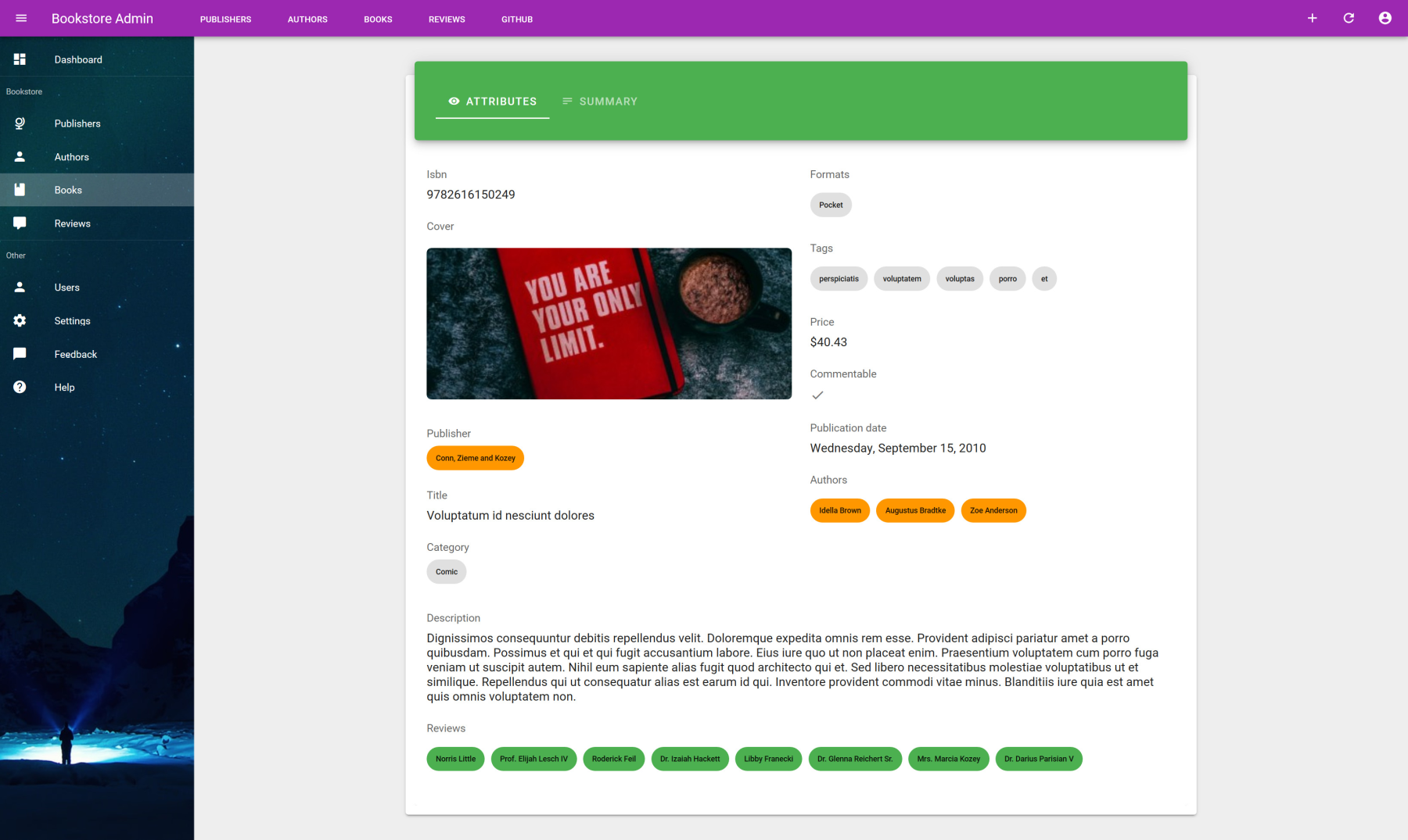
As you have total freedom on the layout, it's really easy to create a tabbed style show by using any vuetify or custom components. By example you can use the material tabs card component provided by Vue CLI Plugin :
<template>
  <va-show-layout>
    <va-show :item="item">
      <v-row justify="center">
        <v-col lg="8">
          <base-material-tabs-card
            :tabs="[
              { id: 'attributes', icon: 'mdi-eye' },
              { id: 'summary', icon: 'mdi-text' },
            ]"
          >
            <template v-slot:attributes>
              <!-- 1st tab content -->
            </template>
            <template v-slot:summary>
              <!-- 2st tab content -->
            </template>
          </base-material-tabs-card>
        </v-col>
      </v-row>
    </va-show>
  </va-show-layout>
</template>

<script>
export default {
  props: ["title", "item"],
};
</script>
2
3
4
5
6
7
8
9
10
11
12
13
14
15
16
17
18
19
20
21
22
23
24
25
26
27
28
29
# Injector
VaShow
Show component injector which facilitates resource display by using VA component fields. Inject item for each VA field.
PROPS
| Props | Type | Description |
|---|---|---|
| item | object | Explicit item resource object where all properties must be injected into VA fields. |
SLOTS
| Name | Description |
|---|---|
| default | All content form with all inner fields. Item will be injected for each fields. |
Here a full showcase of this injector component :
<template>
  <va-show-layout>
    <va-show :item="item">
      <v-row justify="center">
        <v-col sm="6">
          <base-material-card>
            <template v-slot:heading>
              <div class="display-2">
                {{ title }}
              </div>
            </template>
            <v-card-text>
              <va-field
                source="logo"
                type="image"
                src="thumbnails.large"
                contain
              ></va-field>
              <v-row>
                <v-col>
                  <va-field source="name"></va-field>
                  <va-field source="type" type="select"></va-field>
                </v-col>
                <v-col>
                  <va-field source="founder"></va-field>
                  <va-field source="headquarter"></va-field>
                </v-col>
              </v-row>
              <va-field source="description"></va-field>
              <v-row>
                <v-col lg="6">
                  <va-field source="url" type="url"></va-field>
                  <va-field source="email" type="email"></va-field>
                  <va-field source="active" type="boolean"></va-field>
                </v-col>
                <v-col lg="6">
                  <va-field
                    source="address"
                    :label="$t('address')"
                    v-slot="{ value }"
                  >
                    {{ value.street }}, {{ value.postcode }} {{ value.city }}
                  </va-field>
                  <va-field source="opening_date" type="date"></va-field>
                  <va-field source="books_count" type="number"></va-field>
                </v-col>
              </v-row>
              <va-field
                source="local"
                type="image"
                src="thumbnails.medium"
              ></va-field>
            </v-card-text>
          </base-material-card>
        </v-col>
      </v-row>
    </va-show>
  </va-show-layout>
</template>

<script>
export default {
  props: ["title", "item"],
};
</script>
2
3
4
5
6
7
8
9
10
11
12
13
14
15
16
17
18
19
20
21
22
23
24
25
26
27
28
29
30
31
32
33
34
35
36
37
38
39
40
41
42
43
44
45
46
47
48
49
50
51
52
53
54
55
56
57
58
59
60
61
62
63
64
65
As you can guess, the main role of VaShow is to inject full item resource object on every VA field components which leads to minimal boilerplate code. Then VA field will be able to catch the value of resource property indicated on the source prop.
# Field wrapper
VaField
Wrapper component for field which support label localization and supported VA field, mainly used for show page.
Use default slot for custom needs or use type property for quick usage of valid existing field component.
All other attributes of this component will be merged into child slot.
MIXINS
PROPS
| Props | Type | Description |
|---|---|---|
| source | string | Property of resource for fetching the value to show. Support dot notation for nested object. |
| item | null | Override default item injected by VaShow. |
| label | string | Override default label behavior. Default is to get the localized VueI18n label from both resource and property source. |
| labelKey | string | Override default source key as translated label. |
| type | string | Type of field to use. Not used if you use default slot for advanced custom needs. |
SLOTS
| Name | Description |
|---|---|
| default | Field placeholder. By default use field component according to type props with all other attributes merged. |
DEFAULT LABEL
By default, VaField will try to guess the proper localized label from source prop by following this structure.
If no default slot is provided, VaField will automatically use a specific Va field component under the hood according to the type prop.
So :
<template>
  <va-show-layout>
    <va-show :item="item">
      <va-field source="type" type="select" chip></va-field>
    </va-show>
  </va-show-layout>
</template>
2
3
4
5
6
7
Is perfectly equivalent to :
<template>
  <va-show-layout>
    <va-show :item="item">
      <va-field source="type">
        <va-select-field source="type" chip></va-select-field>
      </va-field>
    </va-show>
  </va-show-layout>
</template>
2
3
4
5
6
7
8
9
Or :
<template>
  <va-show-layout>
    <va-show :item="item">
      <va-field source="type" v-slot="{ item }">
        <va-select-field source="type" :item="item" chip></va-select-field>
      </va-field>
    </va-show>
  </va-show-layout>
</template>
2
3
4
5
6
7
8
9
You can use this component only for label and item value provider and made your own customization. Simply use the default slot provider that will give you the value and full item.
<template>
  <va-show-layout>
    <va-show :item="item">
      <va-field
        source="address"
        :label="$t('address')"
        v-slot="{ value }"
      >
        {{ value.street }}, {{ value.postcode }} {{ value.city }}
      </va-field>
    </va-show>
  </va-show-layout>
</template>
2
3
4
5
6
7
8
9
10
11
12
13
ALL FIELD COMPONENTS
Go to separated fields guide reference to get all supported components for display data. You can still create your own field component if none suit your needs.