# Inputs
VA input components allow editing of particular property of existing API resource object. Mainly used on forms for create and edit views. Can also be used as filter input for VaList. For resource edition, it must be used within VaForm, which handle item injection and form model supply with error messages.
SOURCE AND MODEL
Va inputs support both source and model prop. Source is the original property object where to fetch the value and model will be the final property name with the new value that will be sent on your data provider.
DOT NOTATION SUPPORT
VA inputs accept dot notation for source prop. Very useful for nested object :
<template>
  <va-text-input source="address.street"></va-text-input>
  <va-text-input source="address.postcode"></va-text-input>
  <va-text-input source="address.city"></va-text-input>
</template>
2
3
4
5
It will directly get the value of street property of address object and take the localized label from nested structure. The final form model data that will be sent on your data provider will also respect this nested structure.
# VA inputs
# Text
VaTextInput
Text editing for text value type via a basic text input.
Support textarea mode for long text via multiline prop.
Can be use for any date, datetime or time editing, use type set on date, datetime-local or time.
Render will depend of browser support.
MIXINS
PROPS
| Props | Type | Description |
|---|---|---|
| source | string | Property of resource for fetching the value to show. Support dot notation for nested object. |
| model | string | By default, the source will be the final name that will be sent to the API for create/update. This prop allows you to override this default behavior. |
| v-model | string | Text to be edited. |
| type | string | Type of text input. All HTML type allowed. |
| multiline | boolean | Transform text input into textarea. |
| filled | boolean | Use full filled background color style. |
EVENTS
| Name | Description |
|---|---|
| change | Triggered on any user input interaction. |
| input | Triggered if value updated. |
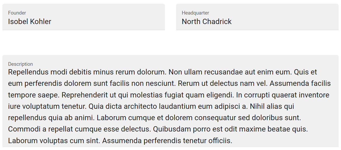
SAMPLE
<template>
  <v-row>
    <v-col sm="6">
      <va-text-input source="founder"></va-text-input>
    </v-col>
    <v-col sm="6">
      <va-text-input source="headquarter"></va-text-input>
    </v-col>
  </v-row>
  <va-text-input source="description" multiline></va-text-input>
</template>
2
3
4
5
6
7
8
9
10
11
Will render :
# Password
VaPasswordInput
Use it for password. No value accepted. Has show/hide behavior for current input.
MIXINS
PROPS
| Props | Type | Description |
|---|---|---|
| source | string | Property of resource for fetching the value to show. Support dot notation for nested object. |
| model | string | By default, the source will be the final name that will be sent to the API for create/update. This prop allows you to override this default behavior. |
| filled | boolean | Use full filled background color style. |
EVENTS
| Name | Description |
|---|---|
| change | Triggered on any user input interaction. |
| input | Triggered if value updated. |
SAMPLE
<template>
  <va-password-input source="password"></va-password-input>
</template>
2
3
Will render :

# Number
VaNumberInput
Optimized for number editing. Just a type number input with step, min and max attribute behavior.
MIXINS
PROPS
| Props | Type | Description |
|---|---|---|
| source | string | Property of resource for fetching the value to show. Support dot notation for nested object. |
| model | string | By default, the source will be the final name that will be sent to the API for create/update. This prop allows you to override this default behavior. |
| v-model | number | Number to be edited. |
| filled | boolean | Use full filled background color style. |
| step | number | The interval step. |
| min | number | The minimum accepted value. |
| max | number | The maximum accepted value. |
EVENTS
| Name | Description |
|---|---|
| change | Triggered on any user input interaction. |
| input | Triggered if value updated. |
SAMPLE
<template>
  <va-number-input source="level" :step="1" :min="0" :max="99"></va-number-input>
</template>
2
3
# Date
VaDateInput
Use for date type value editing. Is composed of a readonly textfield associated to a vuetify datepicker. Do not support time, use classic VaTextInput in that case.
MIXINS
PROPS
| Props | Type | Description |
|---|---|---|
| source | string | Property of resource for fetching the value to show. Support dot notation for nested object. |
| model | string | By default, the source will be the final name that will be sent to the API for create/update. This prop allows you to override this default behavior. |
| v-model | string | Date on ISO format to be edited. |
| filled | boolean | Use full filled background color style. |
| format | string | Name of date format to use for textfield input. Must be predefined on your VueI18n plugin. |
EVENTS
| Name | Description |
|---|---|
| change | Triggered on any user input interaction. |
| input | Triggered if value updated. |
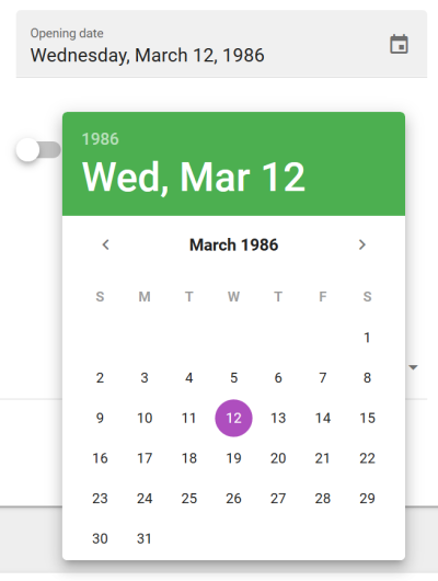
SAMPLE
<template>
  <va-date-input source="publication_date" format="short"></va-date-input>
</template>
2
3
Will render :
# Boolean
VaBooleanInput
Edit value as boolean. Rendered as a switch.
MIXINS
PROPS
| Props | Type | Description |
|---|---|---|
| source | string | Property of resource for fetching the value to show. Support dot notation for nested object. |
| model | string | By default, the source will be the final name that will be sent to the API for create/update. This prop allows you to override this default behavior. |
| v-model | boolean | Boolean to be edited. |
EVENTS
| Name | Description |
|---|---|
| change | Triggered on any user input interaction. |
| input | Triggered if value updated. |
SAMPLE
<template>
  <va-boolean-input source="active"></va-boolean-input>
</template>
2
3
# Rating
VaRatingInput
Edit number value as rating stars. Value should be a valid integer or decimal if half increments enabled. Icons can be edited via $ratingFull, $ratingEmpty and $ratingHalf on Vuetify settings.
MIXINS
PROPS
| Props | Type | Description |
|---|---|---|
| source | string | Property of resource for fetching the value to show. Support dot notation for nested object. |
| model | string | By default, the source will be the final name that will be sent to the API for create/update. This prop allows you to override this default behavior. |
| v-model | number | Number to be edited. |
EVENTS
| Name | Description |
|---|---|
| change | Triggered on any user input interaction. |
| input | Triggered if value updated. |
SAMPLE
<template>
  <va-rating-input source="rating" length="5" half-increments></va-rating-input>
</template>
2
3
Will render :

# Rich text
VaRichTextInput
Full Wysiwyg HTML editor by using TinyMCE 5. Can be bridged to any file browser as elFinder if you use PHP on the backend.
MIXINS
PROPS
| Props | Type | Description |
|---|---|---|
| source | string | Property of resource for fetching the value to show. Support dot notation for nested object. |
| model | string | By default, the source will be the final name that will be sent to the API for create/update. This prop allows you to override this default behavior. |
| v-model | string | HTML text to be edited. |
| height | number | Initial height of editor. |
| menubar | boolean | Activate wysiwyg menu bar. |
| inline | boolean | Activate inline mode of wysiwyg. |
| plugins | array | Full available plugins for editing, see TinyMCE docs. |
| toolbar | string | Toolbar config, see TinyMCE docs. |
| init | object | The full TinyMCE object, check official docs. |
EVENTS
| Name | Description |
|---|---|
| change | Triggered on any user input interaction. |
| input | Triggered if value updated. |
SAMPLE
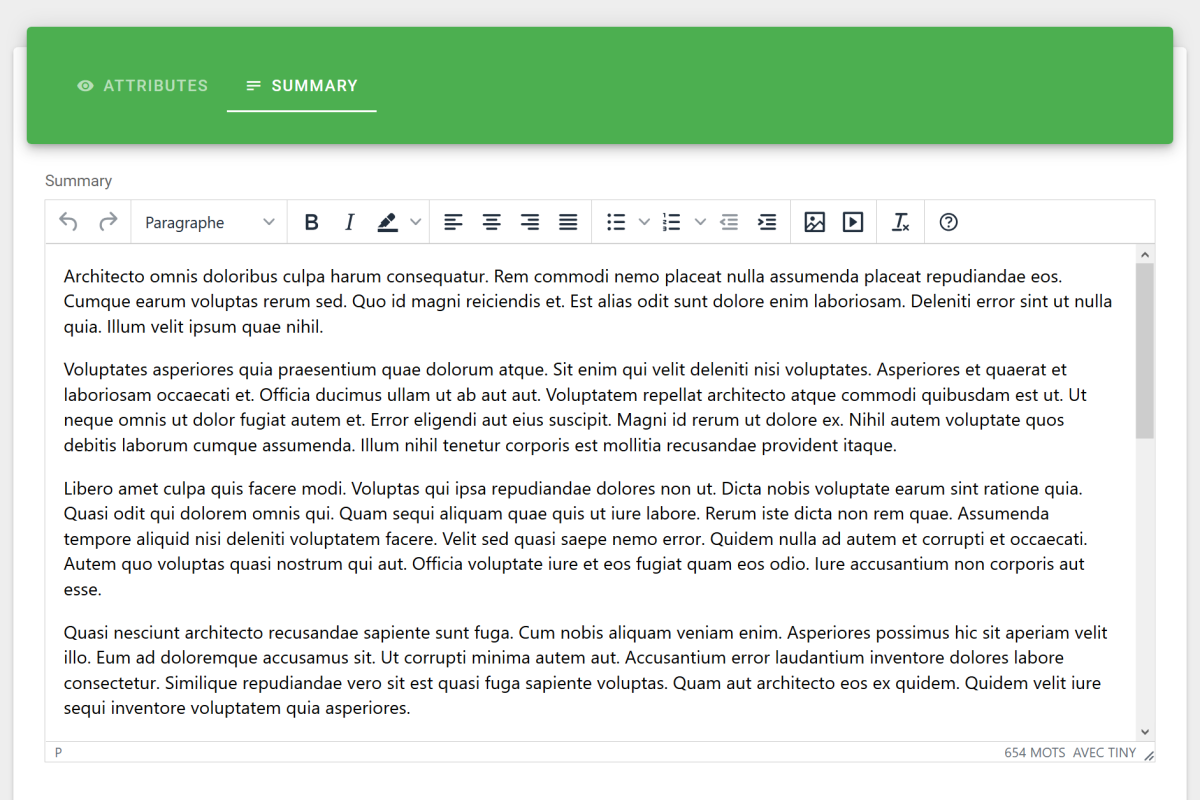
<template>
  <va-rich-text-input source="summary"></va-rich-text-input>
</template>
2
3
Will render :
CDN ASSET
In order to work, this input needs the URL of main TinyMCE JS bundles with a proper API key preloaded. Configure it on your tiny cloud account and add this scripts to the public/index.html :
<script src="https://cdn.tiny.cloud/1/my-api-key/tinymce/5/tinymce.min.js" referrerpolicy="origin"></script>
<script src="https://cdn.tiny.cloud/1/my-api-key/tinymce/5/themes/silver/theme.min.js" referrerpolicy="origin"></script>
<script src="https://cdn.tiny.cloud/1/my-api-key/tinymce/5/icons/default/icons.min.js" referrerpolicy="origin"></script>
2
3
GLOBAL OPTIONS
You may set global actions for TinyMCE in main VuetifyAdmin constructor as explained here. See all supported options.
TINYMCE 5 DOCUMENTATION
Check the official documentation (opens new window) for further details on plugins and toolbar configuration. Use init prop for full control, it will replace other props.
Default init value for init :
{
  height: 500,
  menubar: false,
  plugins: [
    "advlist autolink lists link image charmap print preview anchor",
    "searchreplace visualblocks code fullscreen",
    "insertdatetime media paste code help wordcount",
  ],
  toolbar: "undo redo | formatselect | bold italic backcolor | \
    alignleft aligncenter alignright alignjustify | \
    bullist numlist outdent indent | image media | removeformat | help",,
  inline: false,
}
2
3
4
5
6
7
8
9
10
11
12
13
14
IMAGE UPLOAD HANDLER
You may need a real backend image upload handler in order to avoid the default base64. Use global imageUploadUrl admin TinyMCE options as explain here for setting a handler URL compatible with TinyMCE 5. It will add a direct upload zone on images plugin and as well as enable drag and drop.
Laravel Admin already integrate a functional upload handler that you can activate by adding the upload route :
routes/api.php
Route::group(['middleware' => Impersonate::class], function () {
    //...

    Route::account();
    Route::impersonate();
    Route::upload();

    //...
});
2
3
4
5
6
7
8
9
You may provide admin axios instance to VuetifyAdmin constructor for CSRF integration. If you don't use axios, don't forget to exclude upload route from CSRF inside app/Http/Middleware/VerifyCsrfToken.php.
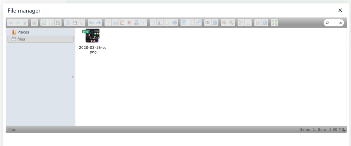
FILE BROWSER
You may want to bridge the Wysiwyg within a file browser. Use global fileBrowserUrl admin TinyMCE options as explain here for setting a backend file browser solution. It will add a picker button for images and media that allows file selection from the file browser.
If you use any PHP framework you should try elFinder which is already integrated on official Laravel Admin package :
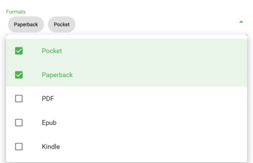
# Select
VaSelectInput
Value editing from a fixed choices. Support multiple and references. If no choices, by default, takes localized enums with source as value from your VueI18n resources locales.
MIXINS
PROPS
| Props | Type | Description |
|---|---|---|
| source | string | Property of resource for fetching the value to show. Support dot notation for nested object. |
| model | string | By default, the source will be the final name that will be sent to the API for create/update. This prop allows you to override this default behavior. |
| reference | string | Name of resource to search into. |
EVENTS
| Name | Description |
|---|---|
| change | Triggered on any user input interaction. |
| input | Triggered if value updated. |
SAMPLE
<template>
  <va-select-input source="formats" multiple></va-select-input>
</template>
2
3
Will render :
LOCALIZED ENUMS
You may centralized all choices for reuse directly inside you locales as explain here. If no choices set, VaSelectInput will lookup for this valid translated key format : resources.{resource}.enums.{source}.{value}.
REFERENCES
If you want select from existing resource reference, use reference prop as follow :
<template>
  <va-select-input
    source="publisher"
    model="publisher_id"
    reference="publishers"
    :filter="{ active: true }"
  ></va-select-input>
</template>
2
3
4
5
6
7
8
It will automatically fetch all publishers and integrate them as choices. Multiple is also supported. Use filter prop for filtering. You may use model in case of the update property request on backend side is different than source.
# Radio group
VaRadioGroupInput
Value editing from a fixed choices. Support references. If no choices, by default, takes localized enums with source as value from your VueI18n resources locales.
MIXINS
PROPS
| Props | Type | Description |
|---|---|---|
| source | string | Property of resource for fetching the value to show. Support dot notation for nested object. |
| model | string | By default, the source will be the final name that will be sent to the API for create/update. This prop allows you to override this default behavior. |
| v-model | string|number|array | Value to be selected, array if multiple. |
| reference | string | Name of resource to search into. |
| column | boolean | Show radios as a column. |
| row | boolean | Show radios as a row. |
EVENTS
| Name | Description |
|---|---|
| change | Triggered on any user input interaction. |
| input | Triggered if value updated. |
SAMPLE
<template>
  <va-radio-group-input source="status" row></va-radio-group-input>
</template>
2
3
Will render :

NO CHECKBOX GROUP
Use above select with multiple prop enabled.
REFERENCES
Same above related VaSelectInput references tip applies, without multiple support obviously.
# Autocomplete
VaAutocompleteInput
Value editing from a searchable choices. Support multiple and references. Allows searching of linked resources from your API.
MIXINS
PROPS
| Props | Type | Description |
|---|---|---|
| source | string | Property of resource for fetching the value to show. Support dot notation for nested object. |
| model | string | By default, the source will be the final name that will be sent to the API for create/update. This prop allows you to override this default behavior. |
| reference | string | Name of resource to search into. |
| minChars | number | Minimum characters to tap before search query launch. |
| searchQuery | string | Name of request query for searching into your API. |
| taggable | boolean | Enable taggable mode. Transform autocomplete into combobox. |
SLOTS
| Name | Description |
|---|---|
| selection | Define a custom selection appearance |
| item | Define a custom item appearance |
EVENTS
| Name | Description |
|---|---|
| change | Triggered on any user input interaction. |
| input | Triggered if value updated. |
SAMPLE
<template>
  <va-autocomplete-input
    source="authors"
    model="author_ids"
    multiple
    reference="authors"
  ></va-autocomplete-input>
</template>
2
3
4
5
6
7
8
Will render :
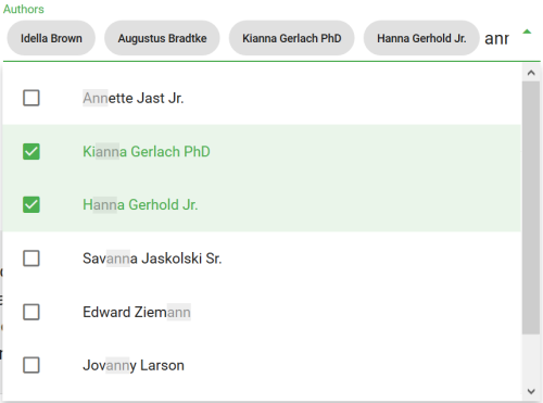
SEARCH
Use minChars and searchQuery to configure the minimal char needed before search and the query search parameter key which is q by default. It will reuse getList data provider method with a custom search filter.
Use fields prop to reduce API query over fetching for better performance.
TAGGABLE
Autocomplete will be transformed into combobox component as soon as you enable taggable prop. It will allow you to create new tags on the fly.
# File
VaFileInput
Allow row file uploads. Can be multiple. Current files will be shown as simple link or thumbnail image and can be deleted. Use VaFileField or VaImageField under the hood. No Ajax support.
MIXINS
PROPS
| Props | Type | Description |
|---|---|---|
| source | string | Property of resource for fetching the value to show. Support dot notation for nested object. |
| model | string | By default, the source will be the final name that will be sent to the API for create/update. This prop allows you to override this default behavior. |
| preview | boolean | Show file thumbnail image instead of simple link. |
| itemValue | string | Attribute where taking the id value for identify files to delete. |
| accept | string | Add HTML5 accept attribute for simple client-side validation. |
SLOTS
| Name | Description |
|---|---|
| default | Default slot if you need to replace default VaFileField or VaImageField. |
EVENTS
| Name | Description |
|---|---|
| change | Triggered on any user input interaction. |
| input | Triggered if value updated. |
SAMPLE
<template>
  <va-file-input
    source="local"
    preview
    multiple
    src="thumbnails.medium"
    lg="4"
  >
  </va-file-input>
</template>
2
3
4
5
6
7
8
9
10
Will render :

IMAGES
Use preview for image gallery support, use VaImageField under the hood.
DATA PROVIDER FILE UPLOAD
2 different solutions :
- Base64 : JSON friendly but more payload size and generally poorly integrated on server-side.
- FormData : Send raw binary file as-is inside classic
multipart/form-data. Poor FormData API but better native server-side integration thanks toUploadedFilewith native MIME validation.
Laravel data provider of VuetifyAdmin use the second method for easier server-side integration. It uses a objectToFormData helper for this, more info here in case you want use it for your custom data provider.
Raw files will be send into your update or create API according to given source or model prop.
DATA PROVIDER FILE DELETION
This file input will use VaFileField or VaImageField with clearable prop enabled under the hood which allows file removing. It will fill an array which contains media id that should be deleted on backend. You can use itemValue prop if media value different than id. Then this array will be send to your update API with a specific delete property which will take this name format : {source}_delete.
If using Laravel Admin, this RequestMediaTrait will done already everything for you.
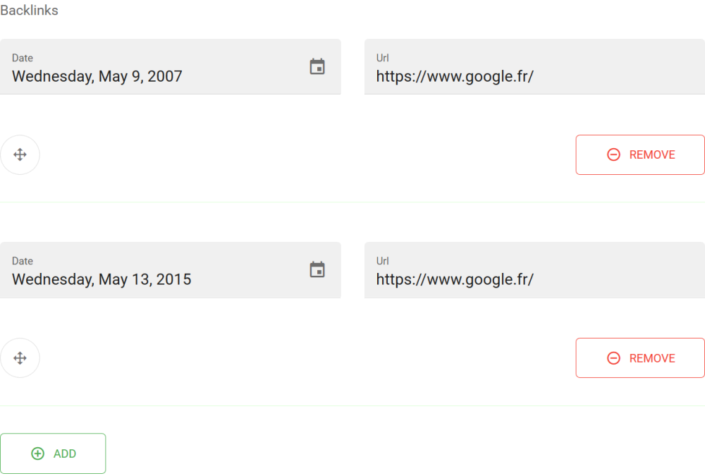
# Array
VaArrayInput
Allow multiple embed inputs as array. See it as a repeater. Support adding, removing, as well as moving via drag thanks to VueDraggable.
MIXINS
PROPS
| Props | Type | Description |
|---|---|---|
| source | string | Property of resource for fetching the value to show. Support dot notation for nested object. |
| model | string | By default, the source will be the final name that will be sent to the API for create/update. This prop allows you to override this default behavior. |
| v-model | array | List of object to edit. |
SLOTS
| Name | Description |
|---|---|
| default | Your repeatable group of inputs components. |
EVENTS
| Name | Description |
|---|---|
| change | Triggered on any user input interaction. |
| input | Triggered if value updated. |
SAMPLE
<template>
  <va-array-input source="backlinks" :label="$t('backlinks')" v-slot="props">
    <v-row>
      <v-col sm="6">
        <va-date-input v-bind="props" source="date"></va-date-input>
      </v-col>
      <v-col sm="6">
        <va-text-input v-bind="props" source="url"></va-text-input>
      </v-col>
    </v-row>
  </va-array-input>
</template>
2
3
4
5
6
7
8
9
10
11
12
Will render :
LABEL
For proper inner localization, use nested structure :
//...
  "fields": {
    //...
    "backlinks": {
      "date": "Date",
      "url": "Url"
    }
  }
//...
2
3
4
5
6
7
8
9
As we cannot have proper label for backlinks, use label prop for explicit label.
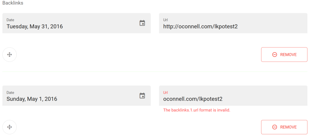
API VALIDATION HANDLING
The final form model will stay a classic array. In the above example, if encoded in FormData, it will be sent on this format : backlinks[$i][(date|url)]. In case of Laravel using, you may use this validation rule :
public function rules()
{
    return [
        //...
        'backlinks.*.date' => 'required|date',
        'backlinks.*.url' => 'required|url',
    ];
}
2
3
4
5
6
7
8
And it should work perfectly fine :
# Custom component
You can perfectly create your own VA input component by using input mixin component. Very useful for editing complex property object or custom advanced input UI for primitives.
src/components/inputs/MyCustomInput.vue
<template>
  <va-input v-bind="$props">
    <v-btn @click="decrement">
      <v-icon small>mdi-minus-circle-outline</v-icon>
    </v-btn>
    <input type="number" :value="value" @blur.native="change" @input="update" />
    <v-btn @click="increment">
      <v-icon small>mdi-plus-circle-outline</v-icon>
    </v-btn>
  </va-input>
</template>

<script>
import Input from "vuetify-admin/src/mixins/input";

export default {
  mixins: [Input],
  props: {
    /**
     * Number to be edited.
     * @model
     */
    value: {
      type: Number,
      default: 0,
    },
  },
  methods: {
    decrement() {
      this.update(this.value - 1);
    },
    increment() {
      this.update(this.value + 1);
    }
  }
};
</script>
2
3
4
5
6
7
8
9
10
11
12
13
14
15
16
17
18
19
20
21
22
23
24
25
26
27
28
29
30
31
32
33
34
35
36
37
V-MODEL
You should use update method provided by input mixin with the new value in order to update the injected parent model on VaForm.
INPUT WRAPPER
You may use VaInput wrapper if you want full error display handling without any effort.
Then register it globally :
src/main.js
import MyCustomInput from "./components/fields/MyCustomInput";

Vue.component("VaMyCustomInput", MyCustomInput)
2
3
NAMESPACE
Note as we add Va as prefix component name. That allows us to have a functional type prop for VaDataTable filters if suitable. So next code will perfectly working :
<template>
  <va-list :filters="filters">
    <!-- VaDataTable -->
  </va-list>
</template>

<script>
export default {
  data() {
    return {
      filters: [
        { source: 'level', type: 'my-custom' },
        //...
      ],
      //...
    };
  },
};
</script>
2
3
4
5
6
7
8
9
10
11
12
13
14
15
16
17
18
19
# Wrapper
VaInput
Dumb input wrapper for custom input components that don't manage natively error states.
MIXINS
PROPS
| Props | Type | Description |
|---|---|---|
| source | string | Property of resource for fetching the value to show. Support dot notation for nested object. |
SLOTS
| Name | Description |
|---|---|
| default | Custom input placeholder which handles value editing |