# Tutorial
This tutorial will show you how to get quick ready for admin development, by using the faking API server JSONPlaceholder (opens new window).
CODESANDBOX
Finished tutorial is directly available on codesanbox (opens new window) !
Use it if you want to play directly with final code. But for deeper understanding it's still recommended to follow full local install steps.
You will find complete source code in the main repo (opens new window).
I PREFER PLAY WITH REAL API BACKEND
Check API Platform tutorial or more advanced Laravel guide for quick starting with generators samples or create your own provider for your custom API. This tutorial stay useful as it's more focused on how to play with Vuetify Admin with any existing API.
# Installation
# Backend API
First you'll need a functional API server in order to play with Vuetify Admin. We will use JSONPlaceholder as API json server hosted on dedicated Okami101 server (opens new window).
Note as it's a read-only server. However all non-GET HTTP request methods are still available although all create/update/delete operations will not be reflected on server-side.
This simple server provides multiple CRUD API endpoints for multiple resources as posts, comments, users, etc. You can find a format description of each route here (opens new window). Vuetify Admin will allows us to implement an nice material admin UI for manage them as quickest as possible.
RUN LOCALLY
If you want truly writeable API CRUD server, it's very easy to launch your own JSON server locally by this simple steps :
npm install -g json-server

wget https://github.com/typicode/jsonplaceholder/raw/master/data.json
json-server --watch data.json
2
3
4
And voilà ! You should have a working API. Example of endpoint : http://localhost:3000/posts?_start=0&_end=15 (opens new window).
# Admin UI
First prepare new Vue CLI admin project as explained on by using dedicated Vue CLI Plugin. To summary :
vue create vuetify-admin-tutorial --preset okami101/vuetify-admin-preset
HOW IT WORKS
See detail here for what's going on when you launch this command.
In the end you should arrive to a wizard installer. Select following options for this tutorial :
- Select
JSON Serveras data provider for this tutorial. - In this tutorial we don't need any authentication so we can directly use guest mode. Or you can use the faker one that use only local storage without need of any API server for testing purpose, any login will be accepted.
- Sets appropriate API endpoint according to the URL of JSON server, i.e. https://jsonplaceholder.okami101.io (opens new window) if remote or http://localhost:3000 (opens new window) if local. You can always change it later.
- Enable users and material theme.
- We don't need of any profile or impersonation feature.
Then launch app by yarn serve --open you should arrive to this step :
CUSTOMIZE THE LAYOUT
You can perfectly customize the layout, which is a simple template component in src/layouts/Admin.vue file. Go to dedicated section for further detail.
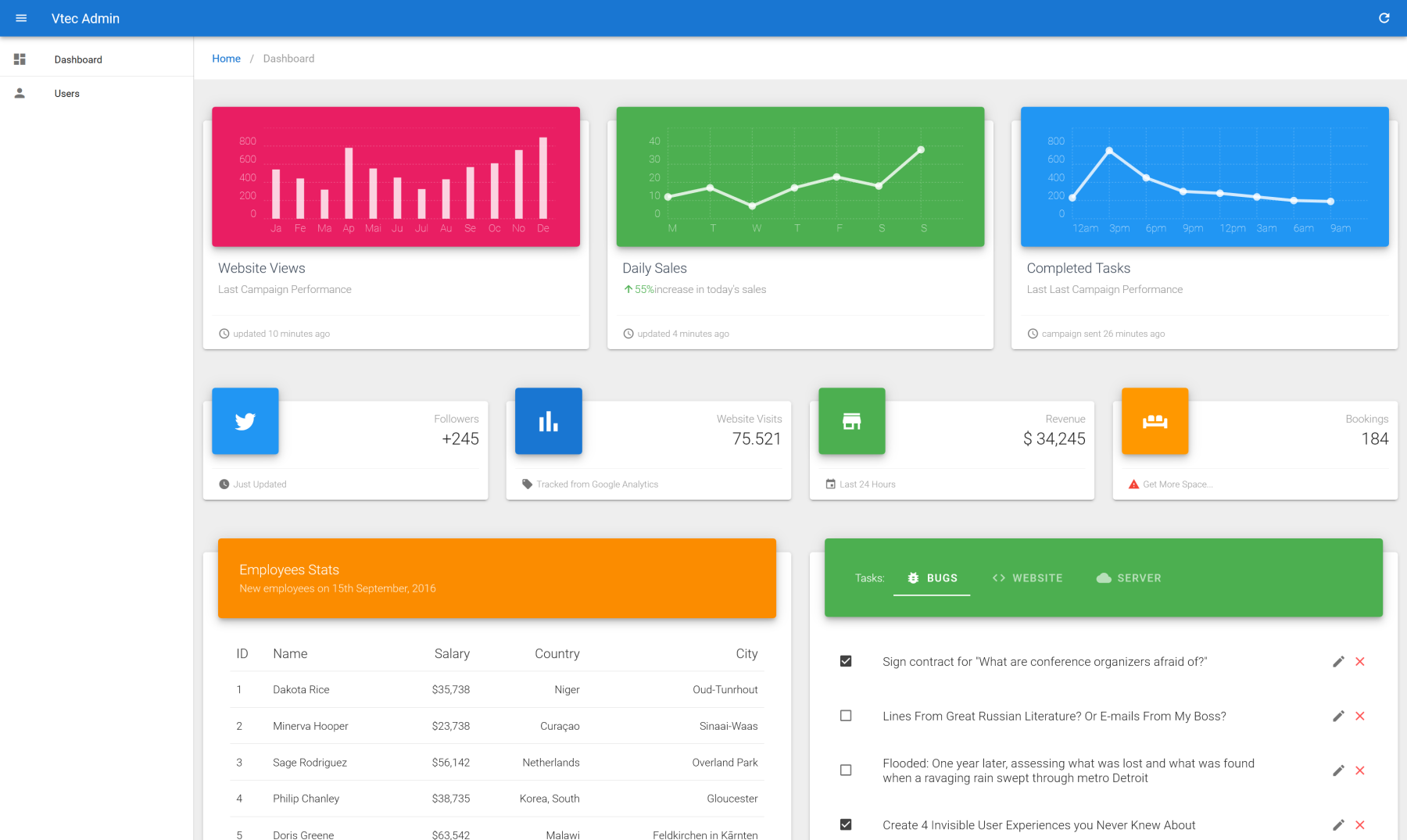
CUSTOMIZE THE DASHBOARD
The default dashboard home page is generated at src/views/Dashboard.vue file. Feel free to add anything you want ! You have access to global $admin.http http client for any data fetching.
# Data Provider
As you will see, the JSON Server data provider is a simple JS object that does all the magic behind the scenes. It translates the particular JSON Server API format (opens new window) into simple methods that Vuetify Admin can understand. For that each provider must follow a specific implementation as explained here. You can find the source code of JSON Server data provider here (opens new window)
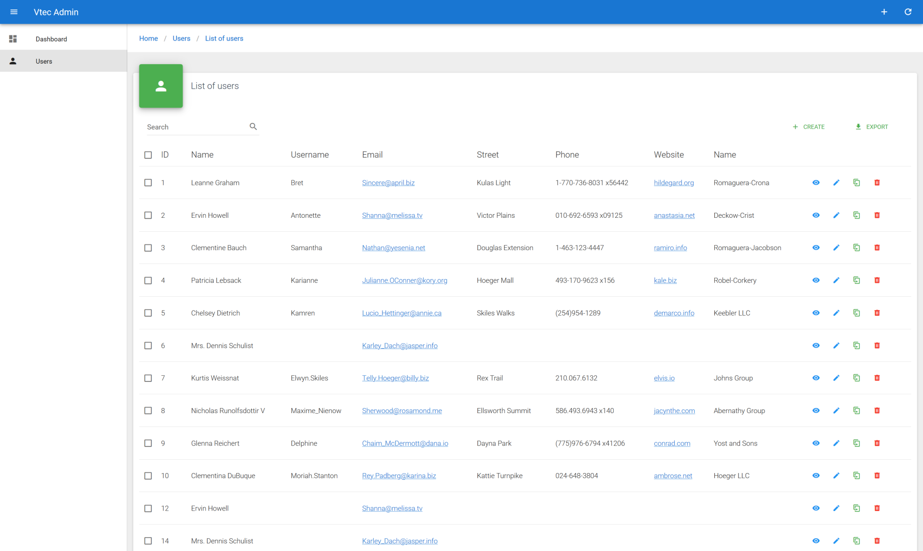
Vue CLI plugin comes with default simple CRUD templates pages for users resources. It's a basic functional single CRUD page interface with aside that should already working with actual users object of previously downloaded data.json database, by using standard name and email properties.
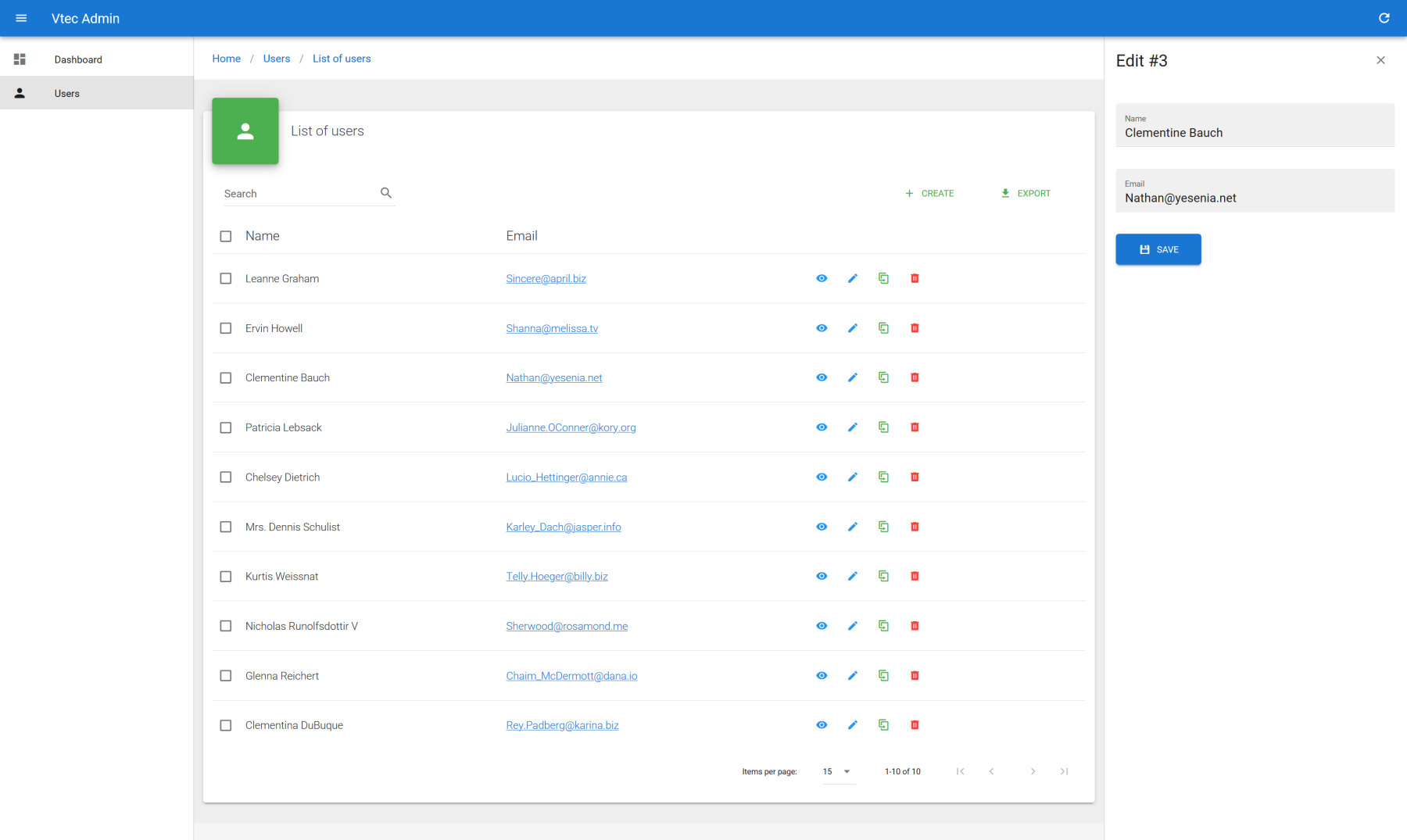
You can create new users, show and edit them on direct aside region, as well as clone them, paginate all list, sort by name, using full text search for filtering and finally export all data with current filtering and sorting inside CSV file. All current context search is updated into URL as query string for keeping state on refresh. You can also bulk delete them by simply select multiple rows.
All users CRUD code templates can be found inside src/resources/users. src/resources will be your main working directory for all resources related CRUD pages development.
DIRECTORY STRUCTURE
Check directory structure graph in order to get a quick global view of admin CLI project.
# Enhance user list
Let's add some new fields to user's list :
src/resources/users/List.vue
<template>
  <!-- VaList -->
</template>

<script>
export default {
  props: ["resource", "title"],
  data() {
    return {
      fields: [
        { source: "id", sortable: true },
        { source: "name", sortable: true },
        { source: "username", sortable: true },
        { source: "email", type: "email" },
        "address.street",
        "phone",
        { source: "website", type: "url" },
        "company.name",
      ],
      //...
    };
  },
  //...
};
</script>
2
3
4
5
6
7
8
9
10
11
12
13
14
15
16
17
18
19
20
21
22
23
24
25
As you can see, fields for data table are just an list of object. source correspond to the targeted property of resource item where to get the value and type is the best suited field for display it on table cells. For basic text a simple string can be put in place of full object. source support dot notation as well.
FIELDS DOCUMENTATION
More detail here. See all supported fields.
LABEL CUSTOMIZATION
You can use label property to customize header column label. However, it's more appropriate to use locales of Vue I18n, because you will have to think about it only once for all fields and inputs, as the default source prop will be the main key. Each property of each resource must follow a convention in order to be recognized. See dedicated section if you want more.
CELL TEMPLATING
You can of course use full Vue.js power for customize all columns instead of using field type thanks to cell slots.
Imagine you want customize address cell with complete information :
src/resources/users/List.vue
<template>
  <va-list>
    <va-data-table :fields="fields">
      <template v-slot:[`field.address`]="{ value }">
        {{ value.street }} {{ value.zipcode }} {{ value.city }}
      </template>
    </va-data-table>
  </va-list>
</template>


<script>
export default {
  props: ["resource", "title"],
  data() {
    return {
      fields: [
        //...
        "address",
        //...
      ],
      //...
    };
  },
  //...
};
</script>
2
3
4
5
6
7
8
9
10
11
12
13
14
15
16
17
18
19
20
21
22
23
24
25
26
27
CUSTOM FIELDS
You're not limited to the existing fields. You have the possibility of creating your own fields.
Next a example of a custom specific address field :
src/components/fields/AddressField.vue
<template>
  <span class="address-field" v-if="value">
    {{ value.street }} {{ value.zipcode }} {{ value.city }}
  </span>
</template>

<script>
import Field from "vuetify-admin/src/mixins/field";

export default {
  mixins: [Field],
};
</script>
2
3
4
5
6
7
8
9
10
11
12
13
Then register it :
src/main.js
import AddressField from "./components/fields/AddressField";

Vue.component("VaAddressField", AddressField);
2
3
You can finally use it for fields :
src/resources/users/List.vue
<template>
  <!-- VaList -->
</template>

<script>
export default {
  props: ["resource", "title"],
  data() {
    return {
      fields: [
        //...
        { source: "address", type: "address" },
        //...
      ],
      //...
    };
  },
  //...
};
</script>
2
3
4
5
6
7
8
9
10
11
12
13
14
15
16
17
18
19
20
# Adding new resource
Now why not to try adding new resource as posts ?
All resources must be registered inside src/resources/index.js. This will allow Vuetify Admin to build all necessary CRUD client side routes as well as API call bridges towards registered data provider. If you have selected related option through above Vue CLI wizard, users should be already registered. For adding posts resource, all we have to do is to add a new resource descriptor object :
src/resources/index.js
export default [
  {
    name: "posts",
    icon: "mdi-post",
  },
  {
    name: "users",
    icon: "mdi-account",
    routes: ["list"],
  },
];
2
3
4
5
6
7
8
9
10
11
name is the unique identifier of resource that will be used as default route path as well as base URL for API calls. icon will be user for link icon identifier or any custom use for your own CRUD pages.
RESOURCES DOCUMENTATION
See this dedicated section for all available options.
Next add new link towards this new resource inside src/_nav.js file, dedicated for sidebar links which supports hierarchical menu as shown here. We can use specific resource link helpers for that. It will create for you compatible object link with above configured route list action, localized label and icon.
src/_nav.js
export default (i18n, admin) => [
  {
    icon: "mdi-view-dashboard",
    text: i18n.t("menu.dashboard"),
    link: "/",
  },
  { divider: true },
  admin.getResourceLink("posts"),
  admin.getResourceLink("users"),
];
2
3
4
5
6
7
8
9
10
Now you should have direct link to a default already functional posts page list. This page is a sort of guesser page that will try to detect the best suited fields by introspecting each value of each resource item properties.
As you can guess, by theirs own nature, this kind of fallback pages should not be used on production at any way. Their greatest utility is to print a direct full usable Vue template code to your browser console with a link to the target CRUD page file where to paste this code.
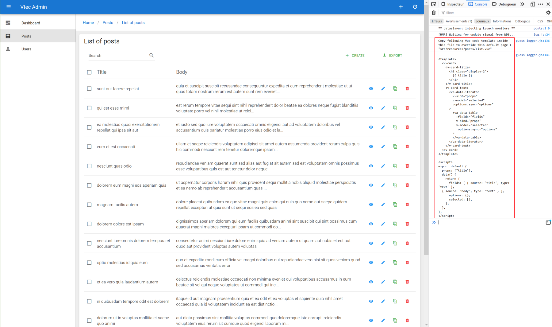
As soon you create this file and paste your code inside it, VA will recognize it and it will take place of guesser page (you should not have specific console message anymore). Do the same for each CRUD pages, i.e. List, Create, Show, Edit. Now you're ready for full customization !
Sample for posts list :
src/resources/posts/List.vue
<template>
  <v-card>
    <v-card-title>
      <h1 class="display-1">
        {{ title }}
      </h1>
    </v-card-title>
    <v-card-text>
      <va-list>
        <va-data-table :fields="fields"></va-data-table>
      </va-list>
    </v-card-text>
  </v-card>
</template>

<script>
export default {
  props: ["title"],
  data() {
    return {
      fields: ["title", "body"],
    };
  },
};
</script>
2
3
4
5
6
7
8
9
10
11
12
13
14
15
16
17
18
19
20
21
22
23
24
25
MATERIAL CARD
Vuetify Admin will print basic VCard by default. If you have selected material theme superset from above Vue CLI wizard, you may use nicer BaseMaterialCard component instead, just replace VCard as next :
<template>
  <base-material-card :icon="resource.icon" :title="title">
    <va-list>
      <!-- DataTable -->
    </va-list>
  </base-material-card>
</template>

<script>
export default {
  props: ["resource", "title"],
};
</script>
2
3
4
5
6
7
8
9
10
11
12
13
# Use dedicated show, create and edit pages for users
If you don't like the default aside for users, we can use the same above methods for quickly create dedicated CRUD pages for users. Simply remove routes filter from next file :
src/resources/index.js
export default [
  {
    name: "posts",
    icon: "mdi-post",
  },
  {
    name: "users",
    icon: "mdi-account",
-    routes: ["list"],
  },
];
2
3
4
5
6
7
8
9
10
11
It will active all CRUD routes actions for user. Now delete src/resources/users/Show.vue and src/resources/users/Form.vue files. Then cleanup users list template as next :
src/resources/users/List.vue
<template>
  <base-material-card :icon="resource.icon" :title="title">
    <va-list>
      <va-data-table :fields="fields"></va-data-table>
    </va-list>
  </base-material-card>
</template>

<script>
export default {
  props: ["resource", "title"],
  data() {
    return {
      fields: [
        { source: "id", sortable: true },
        { source: "name", sortable: true },
        { source: "username", sortable: true },
        { source: "email", type: "email" },
        { source: "address", type: "address" },
        "phone",
        { source: "website", type: "url" },
        "company.name",
      ],
    };
  },
};
</script>
2
3
4
5
6
7
8
9
10
11
12
13
14
15
16
17
18
19
20
21
22
23
24
25
26
27
# Show pages
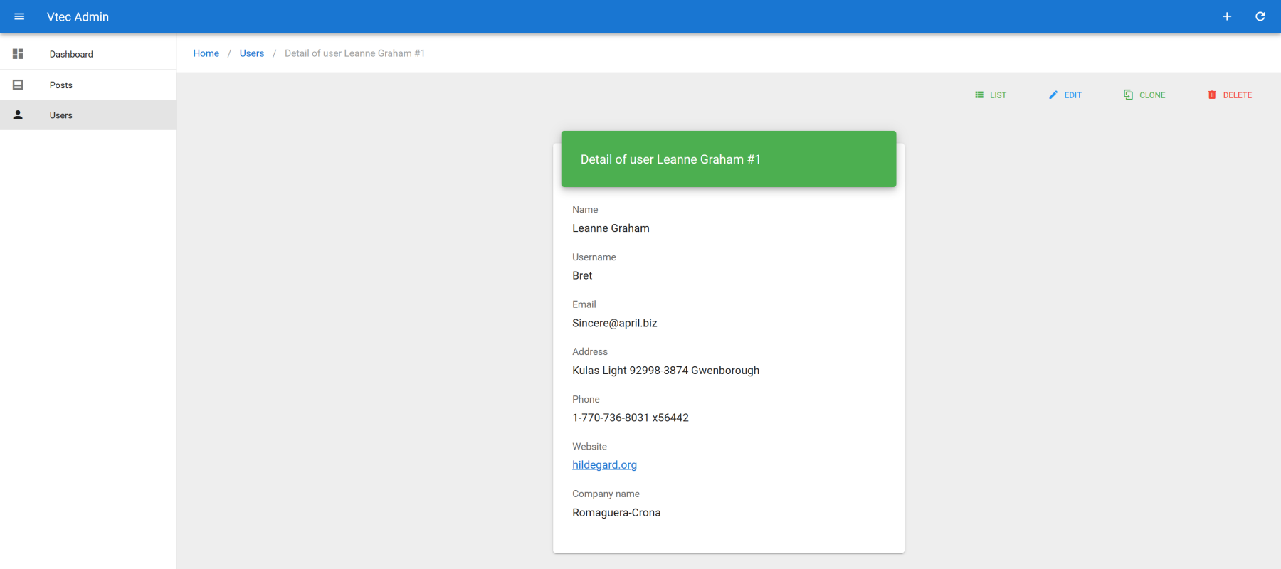
Main use of show pages is to display full resource information, associated to various global actions. It's mainly composed of component injector, aka VaShow that wil inject current resource item to display through all VaField components. Similarly as above fields for VaDataTable, we must use specific source prop for property value to fetch as well as type for define the best suited field for format the value. All others attributes will be merge to under field component. See next show user page :
src/resources/users/Show.vue
<template>
  <va-show-layout>
    <va-show :item="item">
      <v-row justify="center">
        <v-col sm="4">
          <base-material-card>
            <template v-slot:heading>
              <div class="display-1">
                {{ title }}
              </div>
            </template>
            <v-card-text>
              <va-field source="name"></va-field>
              <va-field source="username"></va-field>
              <va-field source="email"></va-field>
              <va-field source="address" type="address"></va-field>
              <va-field source="phone"></va-field>
              <va-field source="website" type="url"></va-field>
              <va-field source="company.name"></va-field>
            </v-card-text>
          </base-material-card>
        </v-col>
      </v-row>
    </va-show>
  </va-show-layout>
</template>

<script>
export default {
  props: ["title", "item"],
};
</script>
2
3
4
5
6
7
8
9
10
11
12
13
14
15
16
17
18
19
20
21
22
23
24
25
26
27
28
29
30
31
32
It's enough to render :
SHOW DOCUMENTATION
See dedicated section.
# Create and edit pages
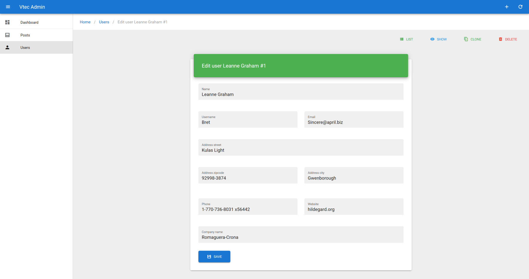
Create and edit page will generally share the same form. It's a good practice to separate it to a dedicated Form component. It will automatically be registered as global {resource}-form component so you can directly use it without manual importing. See next example for user creation and edition page :
src/resources/users/Create.vue
<template>
  <va-create-layout :title="title">
    <users-form :item="item"></users-form>
  </va-create-layout>
</template>

<script>
export default {
  props: ["title", "item"],
};
</script>
2
3
4
5
6
7
8
9
10
11
src/resources/users/Edit.vue
<template>
  <va-edit-layout :title="title">
    <users-form :id="id" :item="item"></users-form>
  </va-edit-layout>
</template>

<script>
export default {
  props: ["id", "title", "item"],
};
</script>
2
3
4
5
6
7
8
9
10
11
src/resources/users/Form.vue
<template>
  <va-form :id="id" :item="item">
    <v-row justify="center">
      <v-col sm="6">
        <base-material-card>
          <template v-slot:heading>
            <div class="display-1">
              {{ title }}
            </div>
          </template>
          <v-card-text>
            <va-text-input source="name"></va-text-input>
            <v-row>
              <v-col>
                <va-text-input source="username"></va-text-input>
              </v-col>
              <v-col>
                <va-text-input source="email"></va-text-input>
              </v-col>
            </v-row>
            <va-text-input source="address.street"></va-text-input>
            <v-row>
              <v-col>
                <va-text-input source="address.zipcode"></va-text-input>
              </v-col>
              <v-col>
                <va-text-input source="address.city"></va-text-input>
              </v-col>
            </v-row>
            <v-row>
              <v-col>
                <va-text-input source="phone"></va-text-input>
              </v-col>
              <v-col>
                <va-text-input source="website"></va-text-input>
              </v-col>
            </v-row>
            <va-text-input source="company.name"></va-text-input>
            <va-save-button></va-save-button>
          </v-card-text>
        </base-material-card>
      </v-col>
    </v-row>
  </va-form>
</template>

<script>
export default {
  props: ["id", "title", "item"],
};
</script>
2
3
4
5
6
7
8
9
10
11
12
13
14
15
16
17
18
19
20
21
22
23
24
25
26
27
28
29
30
31
32
33
34
35
36
37
38
39
40
41
42
43
44
45
46
47
48
49
50
51
It's enough to render :
As you can see, VaForm is simply a injector component that will register an internal full form model initialized by all VA inputs child components. This model is the one that will be sent to the API. For all supported inputs, go here.
FORM DOCUMENTATION
See dedicated section.
# Relationships
Now how we will dealing with relationships between posts and users ?
JSON Server use specific userId property for each post that can be help for linking to a specific user :
{
  "userId": 1,
  "id": 3,
  "title": "ea molestias quasi exercitationem repellat qui ipsa sit aut",
  "body": "et iusto sed quo iure\nvoluptatem occaecati omnis eligendi aut ad\nvoluptatem doloribus vel accusantium quis pariatur\nmolestiae porro eius odio et labore et velit aut"
}
2
3
4
5
6
It will be nice to have a direct link towards existing show or edit user page (you have to create this pages as above before !). It can be simply done thanks to a reference field component.
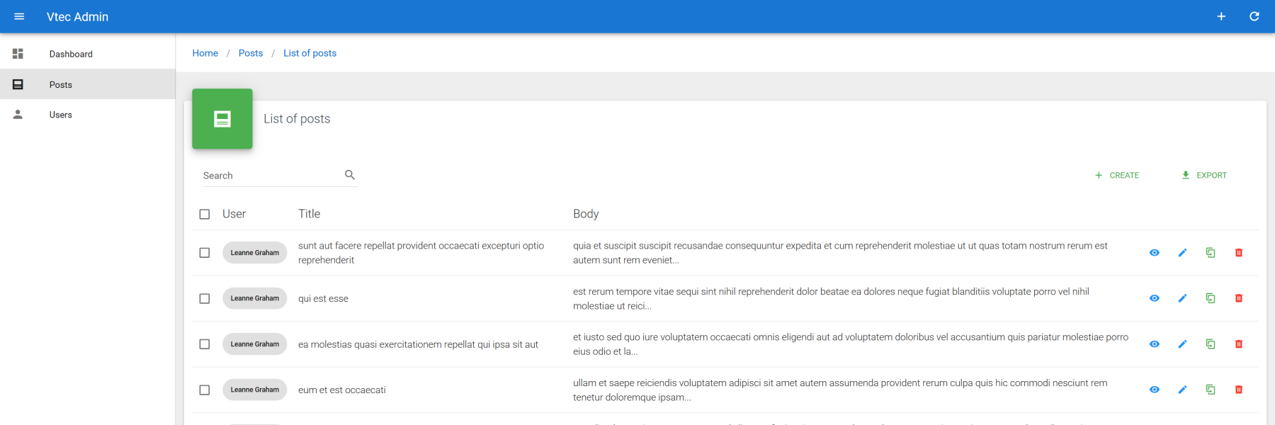
src/resources/posts/List.vue
<template>
  <!-- VaList -->
</template>

<script>
export default {
  props: ["title"],
  data() {
    return {
      fields: [
        {
          source: "userId",
          type: "reference",
          attributes: { reference: "users", link: "edit", chip: true },
        },
        "title",
        "body",
      ],
    };
  },
};
</script>
2
3
4
5
6
7
8
9
10
11
12
13
14
15
16
17
18
19
20
21
22
Note as we add a specific attributes field property that allows specific usage of props or any attributes that inner field component can accept. Check full reference here. In case of reference field, we can see it can accept a specific resource prop where we should put the name of the target linked resource. Then it will show a direct link towards user show page. Use action prop if different thant default show page. Use chip for material chip instead of basic anchor.
Now it will be better with a real name instead of basic ID. But the API don't give us this info. However JSON server API allows linked resource expand on demand. You can see it by using this query /posts/1?_expand=user :
{
  "userId": 1,
  "id": 1,
  "title": "sunt aut facere repellat provident occaecati excepturi optio reprehenderit",
  "body": "quia et suscipit\nsuscipit recusandae consequuntur expedita et cum\nreprehenderit molestiae ut ut quas totam\nnostrum rerum est autem sunt rem eveniet architecto",
  "user": {
    "id": 1,
    "name": "Leanne Graham",
    "username": "Bret",
    "email": "[email protected]",
    "address": {
      "street": "Kulas Light",
      "suite": "Apt. 556",
      "city": "Gwenborough",
      "zipcode": "92998-3874",
      "geo": {
        "lat": "-37.3159",
        "lng": "81.1496"
      }
    },
    "phone": "1-770-736-8031 x56442",
    "website": "hildegard.org",
    "company": {
      "name": "Romaguera-Crona",
      "catchPhrase": "Multi-layered client-server neural-net",
      "bs": "harness real-time e-markets"
    }
  }
}
2
3
4
5
6
7
8
9
10
11
12
13
14
15
16
17
18
19
20
21
22
23
24
25
26
27
28
29
NO AUTO FETCH FROM USERS ?
Contrary to React Admin equivalent, reference field doesn't support auto fetching target resource from API. Instead we prefer to rely on backend capacity to give full object on demand that allows internal eager loading for better performance.
So how can use it ? Simply by using specific include prop of VaList component. In case of JSON server data provider, it's an object which accepts both expand and embed property. Then don't forget to change userId to user as source prop for reference field.
src/resources/posts/List.vue
<template>
  <base-material-card :icon="resource.icon" :title="title">
    <!-- Title -->
    <v-card-text>
      <va-list :include="{ expand: ['user'] }">
        <!-- DataTable -->
      </va-list>
    </v-card-text>
  </base-material-card>
</template>

<script>
export default {
  props: ["resource", "title"],
  data() {
    return {
      fields: [
        {
          source: "user",
          type: "reference",
          attributes: { reference: "users", action: "edit", chip: true },
        },
        //...
      ],
      //...
    };
  },
};
</script>
2
3
4
5
6
7
8
9
10
11
12
13
14
15
16
17
18
19
20
21
22
23
24
25
26
27
28
29
But now you have an ugly full json object. How can we stringify it ? 2 options : either locally by using itemText prop or globally which is recommended as it will apply for all cases, notably autocomplete, choices, CRUD default page titles, etc. Just set the label property at the resource level. Note as it can be a function callback that take a valid resource object as argument. We will set it for both posts and users :
src/resources/index.js
export default [
  {
    name: "posts",
    icon: "mdi-post",
    label: "title",
  },
  {
    name: "users",
    icon: "mdi-account",
    label: "name",
  },
];
2
3
4
5
6
7
8
9
10
11
12
Then you should have nice linkable labelled chip for users :
RELATIONSHIP IN SHOW PAGE
Use the include property on global resource object descriptor to define it globally. It will be used as default for all GET based method for data fetching. VaList will use it as well if not defined, but it still can be overridden.
src/resources/index.js
export default [
  {
    name: "posts",
    icon: "mdi-post",
    label: "title",
    include: { expand: ["user"] },
  },
  //...
];
2
3
4
5
6
7
8
9
# Form
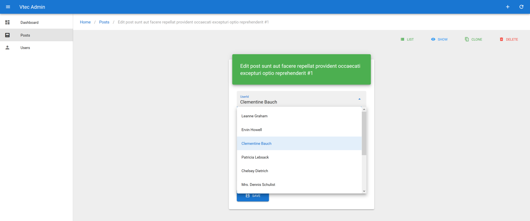
Now we may add the possibility of attach user on any posts. We can use a simple select input for that :
src/resources/posts/Form.vue
<template>
  <va-form :id="id" :item="item">
    <v-row justify="center">
      <v-col sm="4">
        <base-material-card>
          <!-- Title -->
          <v-card-text>
            <va-select-input
              source="userId"
              reference="users"
            ></va-select-input>
            <va-text-input source="title"></va-text-input>
            <va-text-input source="body" multiline></va-text-input>
            <va-save-button></va-save-button>
          </v-card-text>
        </base-material-card>
      </v-col>
    </v-row>
  </va-form>
</template>
2
3
4
5
6
7
8
9
10
11
12
13
14
15
16
17
18
19
20
Just use userId as source, users as reference and you're done :
AUTOCOMPLETE
Just replace va-select-input by va-autocomplete-input and you're done ! User search will be already functional by using default q query parameter for full text search of JSON Server.
# Filters
So we have global search as default filter from posts page list. It would be trivial to have the possibility to filter by user too. It's also as simple as adding fields. Simply add a new select filter object and bind it to VaList component as next :
src/resources/posts/List.vue
<template>
  <base-material-card :icon="resource.icon" :title="title">
    <va-list :filters="filters">
      <!-- DataTable -->
    </va-list>
  </base-material-card>
</template>

<script>
export default {
  props: ["resource", "title"],
  data() {
    return {
      filters: [
        {
          source: "userId",
          type: "select",
          alwaysOn: true,
          attributes: { reference: "users" },
        },
      ],
      //...
    };
  },
};
</script>
2
3
4
5
6
7
8
9
10
11
12
13
14
15
16
17
18
19
20
21
22
23
24
25
26
It's a simple object that will be translated as valid supported input that reacts as you type. Same behavior than fields apply for source, type, and attributes. Note as by default filter is hidden under a dropdowns next to global actions on right side. It will allow filter activation on demand, without UI pollution with many inputs. the alwaysOn prop will always reveal filter without being able to remove it.
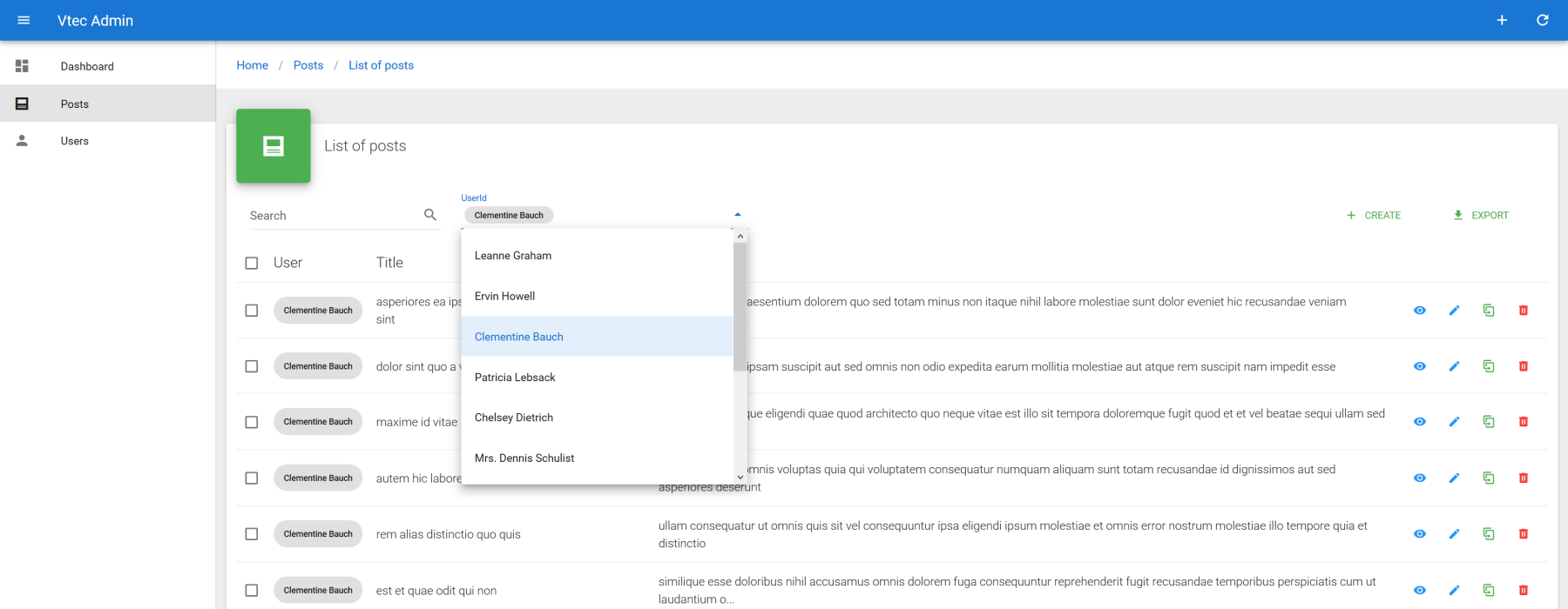
FILTERS DOCUMENTATION
More detail here. See all supported inputs.
FILTER TEMPLATING
It's possible to use direct Vue.js code for filters via filter slots.
# Nested relationships
Now how about show all comments linked to a post ? Show or Edit pages would be the ideal place for adding a new data table list pre filtered on current post. Let's first add new comments resource :
src/resources/index.js
export default [
  {
    name: "posts",
    icon: "mdi-post",
  },
  {
    name: "comments",
    icon: "mdi-comment",
    label: "name",
    actions: ["delete"],
  },
  //...
];
2
3
4
5
6
7
8
9
10
11
12
13
ACTIONS
Use actions property for disabling client related routes as we'll not use them. It will automatically disable all related action buttons.
Next go to show page and add a new list iterator component after show card :
src/resources/posts/Show.vue
<template>
  <va-show-layout>
    <va-show :item="item">
      <!-- VaFields -->
    </va-show>
    <base-material-card
      :icon="$admin.getResource('comments').icon"
      :title="$admin.getResource('comments').pluralName"
    >
      <va-list
        resource="comments"
        disable-pagination
        disable-query-string
        :filter="{
          postId: id,
        }"
      >
        <va-data-table :fields="fields" disable-select></va-data-table>
      </va-list>
    </base-material-card>
  </va-show-layout>
</template>

<script>
export default {
  props: ["id", "title", "item"],
  data() {
    return {
      fields: [
        { source: "name", sortable: true },
        { source: "email", type: "email" },
        "body",
      ],
    };
  },
};
</script>
2
3
4
5
6
7
8
9
10
11
12
13
14
15
16
17
18
19
20
21
22
23
24
25
26
27
28
29
30
31
32
33
34
35
36
37
Will render :
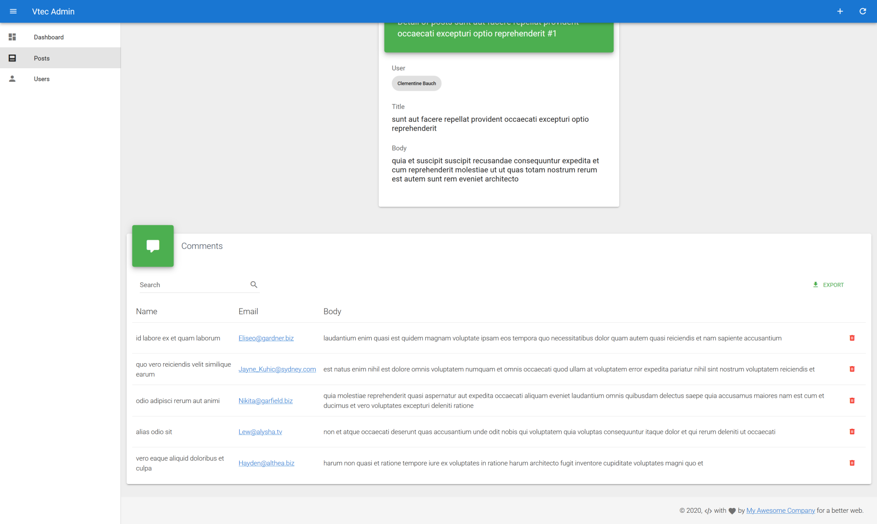
The most important part is to precise the resource to fetch on VaList component and put the id of current post into internal filter of list. All crud action buttons will be auto hidden according to above resource config. You can now do the same for posts linked to a user at user show or edit page as exercise !
ASSOCIATIONS
It's not relevant for this case, but you can also add association support directly from this list ! It will add a new autocomplete for associate as well as dissociate button on each data table row. Ideal for pivot relations. See more.
# Authentication
You can find a full dedicated section for authentication API integration, either by using provided ones or implementing your own.
It' preferable to enable authentication at first Vue CLI install by selecting any valid or custom auth provider as it will install all functional Login and Profile templates for you.
# Conclusion
Well done if you got so far in this tutorial, you now have all basic concepts for UI side development and you're ready to test within a real API. Go to the dedicated section for full spec of implementing your own or check next API Platform for more advanced API showcase.